Devon Lueder
Graphic Design
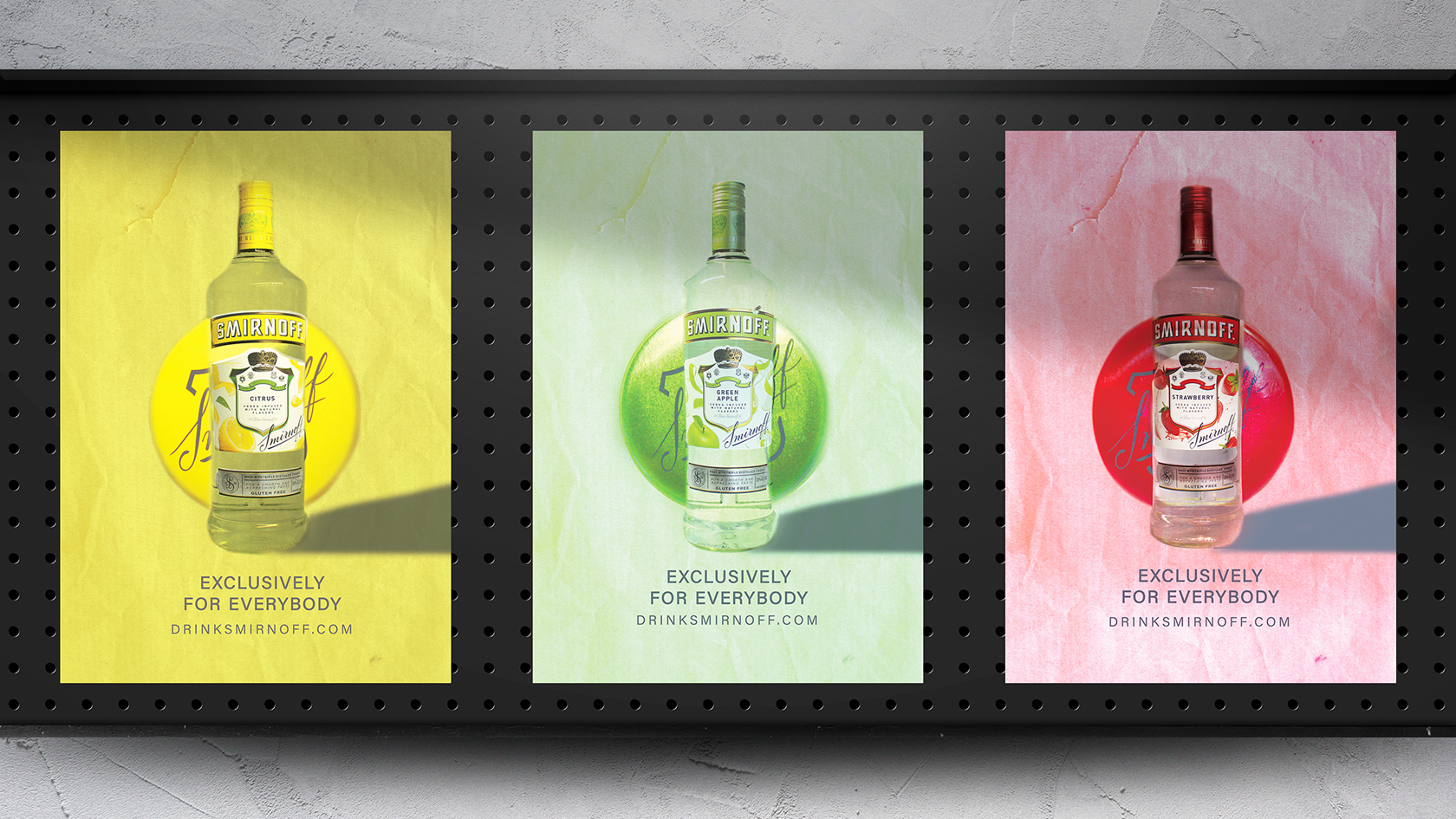
Smirnoff Ad Series
Smirnoff is one of the largest vodka brands in the world. Smirnoff has many different flavors and is found everywhere. I wanted to have a different approach than other vodka brands have had for poster ads. I wanted to show off three of their flavors that I think sound tasty. For this student project, I wanted to show the different flavors of vodka from Smirnoff. Other ads I had found made their brand look fancy and expensive. I wanted to make Smirnoff look more “Exclusively For Everybody”. Using brighter colors and more textures. I learned that photoshopping backgrounds out of clear bottles is very hard to do. I did have fun taking all the pictures of the bottles. Adding the cap to the background makes it feel higher-end yet still shows that anyone can afford this bottle. I think this was a great way to show off some of Smirnoff's brands.
- Skills: Photography, Layout
- Programs: Photoshop
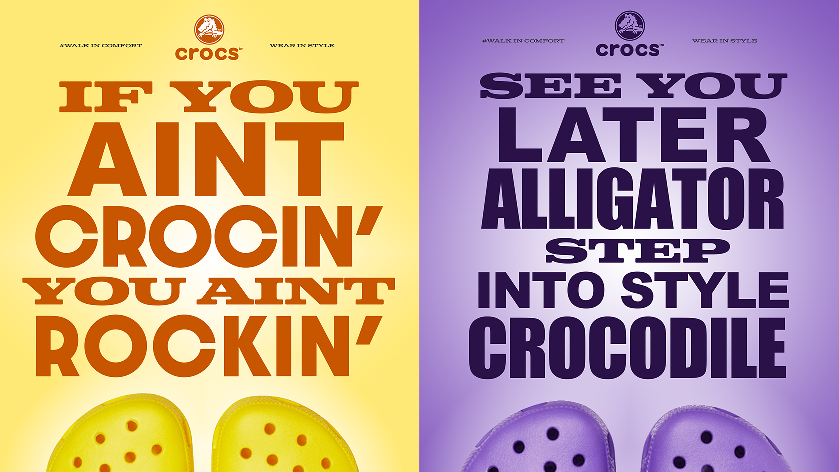
Croc Poster Series
Crocs are a shoe/clog company that has fun ways of personalizing your foot ware. Croc has little “giblets” you can attach to your clog to personalize them. They have many fun colors and patterns. Also, there are funny sayings around Crocs from the purchasers. For this student project, I wanted to make posters that were as fun as Crocs clogs. My goal was to show off both the fun colors as well as a couple of sayings people have come up with. To keep the fun going, I wanted to use typography to drive the ad. Using only colors from the clogs were incorporated into the posters. The typography color is from the color inside of the holes on the clogs. As for the background, the color is from the exterior of the clog with white in a gradient. I think adding the clogs on the bottom adds to the fun in this poster.
- Skills: Typography, Layout
- Programs: Illustrator
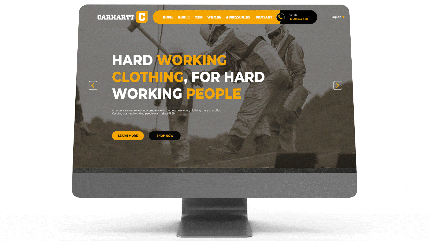
Carhartt Rebrand
Carhartt is a clothing company with some of the best work clothing on the market. From construction to scrubs, to jackets, to underwear. Carhartt is widely known and can be seen anywhere. For this student project, I wanted to modernize Carhartt. Sticking to their roots I wanted to keep everything industrial and strong. I wanted to show off some of the products they sell for men and women. Also, I wanted to use duo-toned squares for the pictures on the website. This rebrand would also include business cards, merch, and uniforms. Keeping everything industrial and simple is how I attacked this project. Using orange where I could and kept the tough and industrial all while keeping that modern look. Changing the logo to a C with half of the H inside of the letter is how the logo was made.
- Skills: Ideation, Layout, Photo Compositing
- Programs: Photoshop
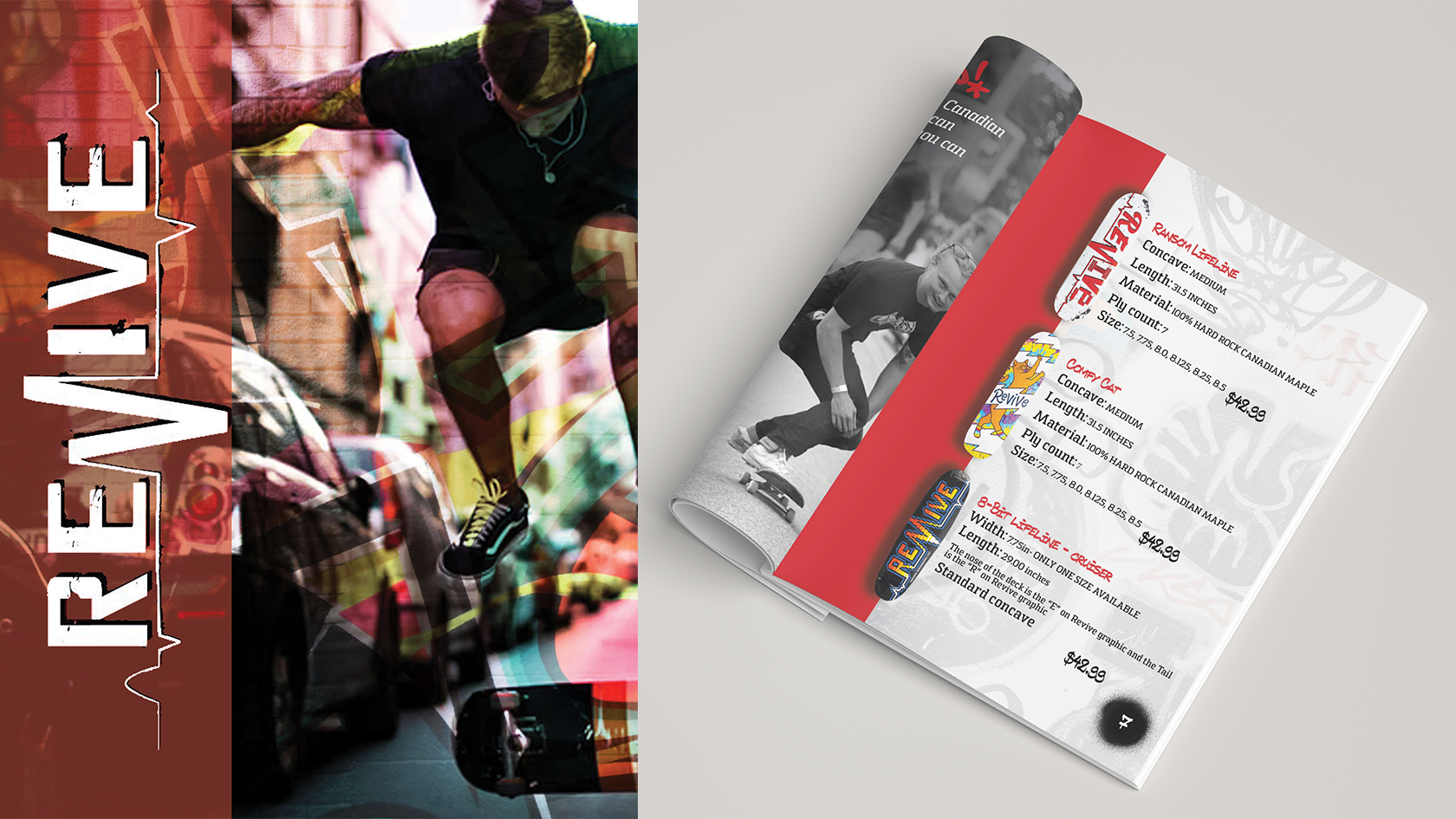
Revive Booklet
They are growing names in the skateboard community. Their main way of getting out to people is on the CEOʼs YouTube channel Andy Schrock. This booklet is a way for them to send out and get their name out using a mailing list. For this student project, I wanted to use Revive skateboards. My goal was to make something Revive wouldnʼt do. On their website, there is very little information about them and who they are. This booklet would allow them to add future products with boards they send out. Use red overlays and red bars throughout the booklet to keep with the red color they branded around. Also, use a spray paintbrush around the page numbers to make it feel like it was painted on. Furthermore, I used graffiti walls in the background to keep with the street aesthetic skateboarding has
- Skills: Layout, Photo compositing
- Programs: InDesign
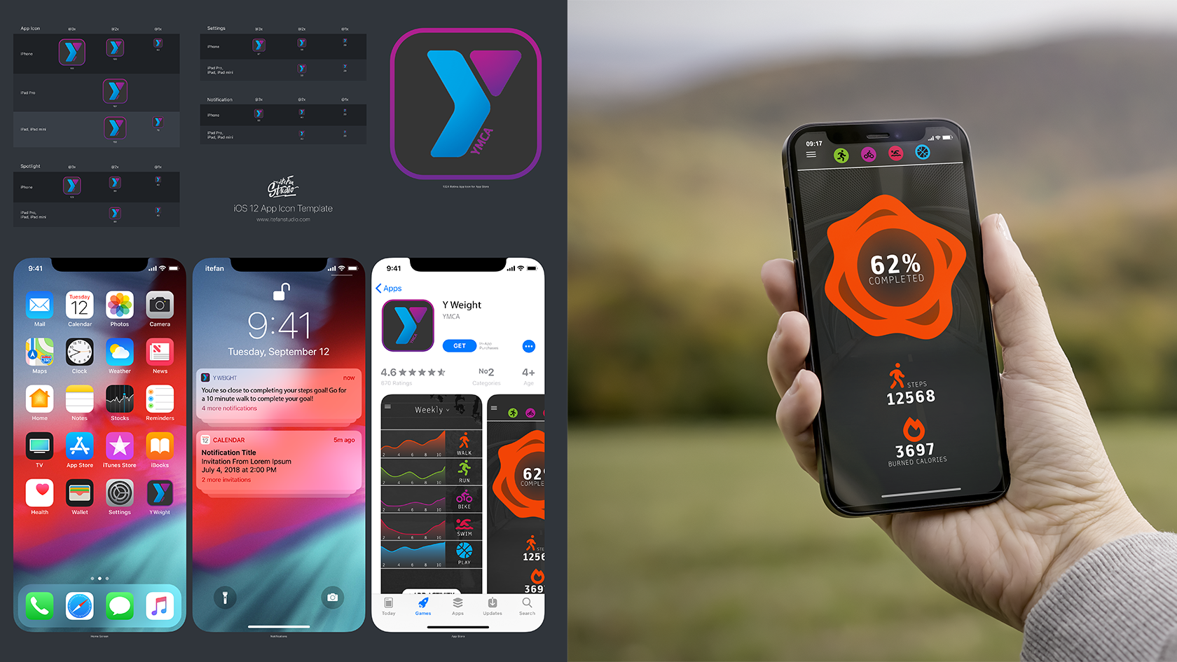
YMCA App
The YMCA is the leading nonprofit committed to strengthening the community by empowering young people, improving the health and well-being of people of all ages, and inspiring action in and across communities. For this school project, I wanted to make an app for tracking your fitness. This app would track any physical activity you do on a day-to-day basis. I used graphs to show the difference in daily tracking. Of course, you can get a closer look into exactly how many steps have been taken or how much time you have been doing your activity.
- Skills: UX design, Layout
- Programs: Photoshop
MANIFEST
We believe, we take action, we produce, we achieve.As creatives, we manifest dreams into reality, no matter the medium. We take ideas to the next level, transforming them, bringing them to life, and revealing more than meets the eye. Our potential is limitless; our imagination and passion are manifest.
Creative
- Kristin Shafel - Creative Director
Archived Portfolios
Contact Us
- Contact - Program Faculty