Chocolate Shoppe Ice Cream Site Redesign
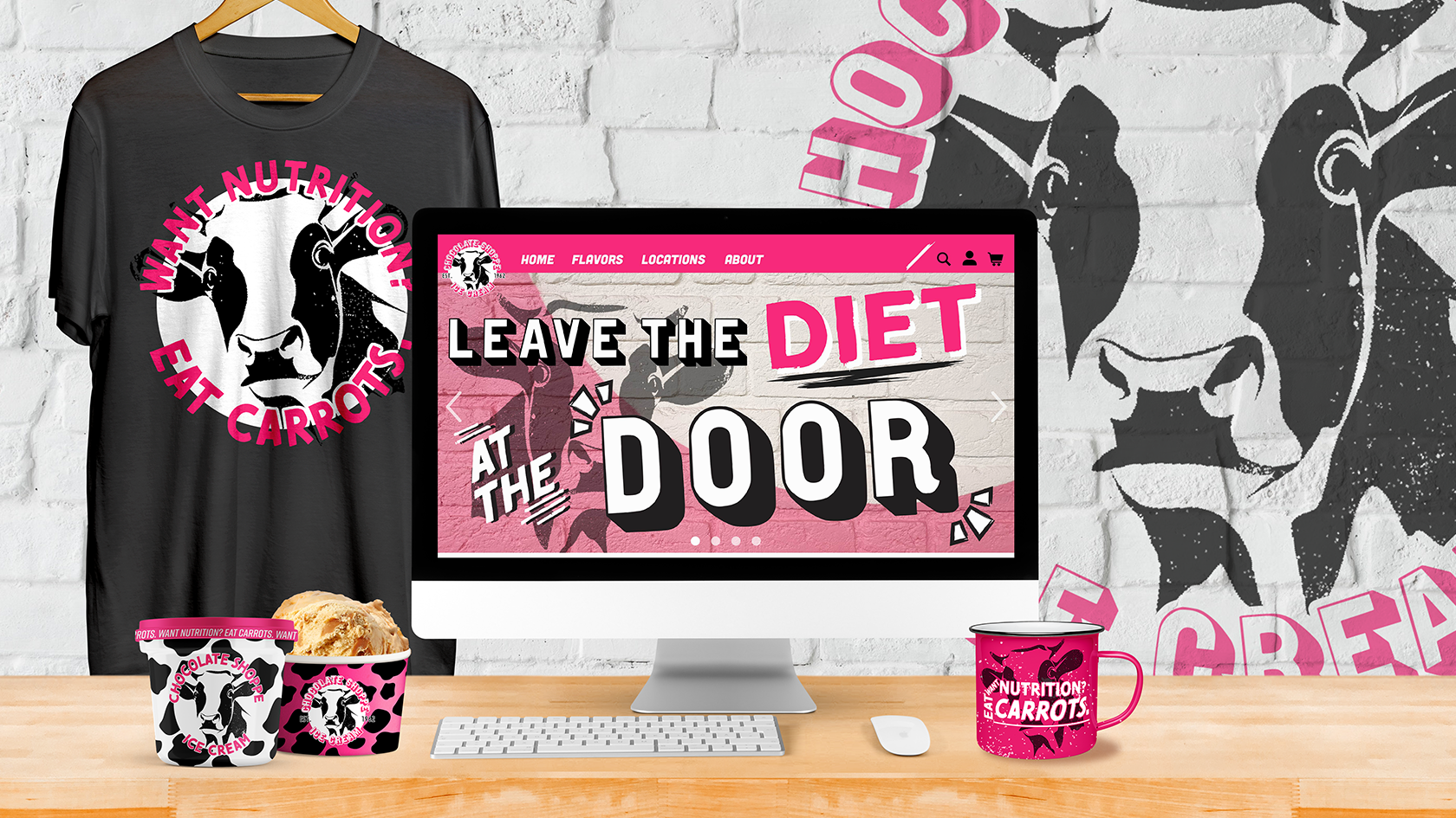
In our integrated design class, we were tasked with finding a product based website that needed some serious TLC, and mocking up multiple different pages of how the new site should look, from the homepage to the shopping cart. This project helped the class explore the more graphic layout part of site design, as we were to only mockup the site in photoshop and not actually worry about coding an actual site. I feel like this is one of my strongest pieces to date, as I was able to find a new way to rebrand Wisconsin's beloved 'Chocolate Shoppe' that took their sarcastic quotes and humor, and just ran with it completely. I also did more than just a site redesign as I felt I couldn't use their current logo design, so I redesigned it to be more inline with the new attitude, along with mocking up additional product and merchandise designs.
- Skills: Concept, Web layout, Graphic design, Branding, Typography
- Programs: Adobe Illustrator, Photoshop
Mrs. Meyers Instagram Advertising
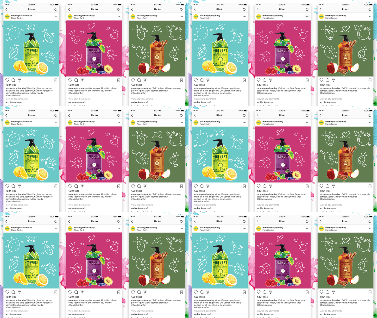
Our Social Media Concepting class was tasked with taking a brand or product that isn't very exciting or interesting upon first glance, and coming up with instagram posts that would be creative, engaging, and worked to think outside the box. I chose to use the brand Mrs. Meyers cleaning products, and add an illustrative spin on how to show off their all natural scents. I found Mrs. Meyers to have an interesting style since they used stick people and simple line drawings to stand out from more flashy branding. I had the idea of taking pictures of what each scent was made out of, turn them into illustrations using photoshop filters, and arrange them into the shape of the bottle itself. I felt it would also help play or the fact that Mrs. Meyers pushes their products as more natural and earth friendly cleaning products. I also added the minor animations as a way to help link my more detailed approach on the Meyers style, and their more simple line work.
- Skills: Photo editing, Animation, Branding, Social media marketing
- Programs: Adobe Illustrator, Photoshop
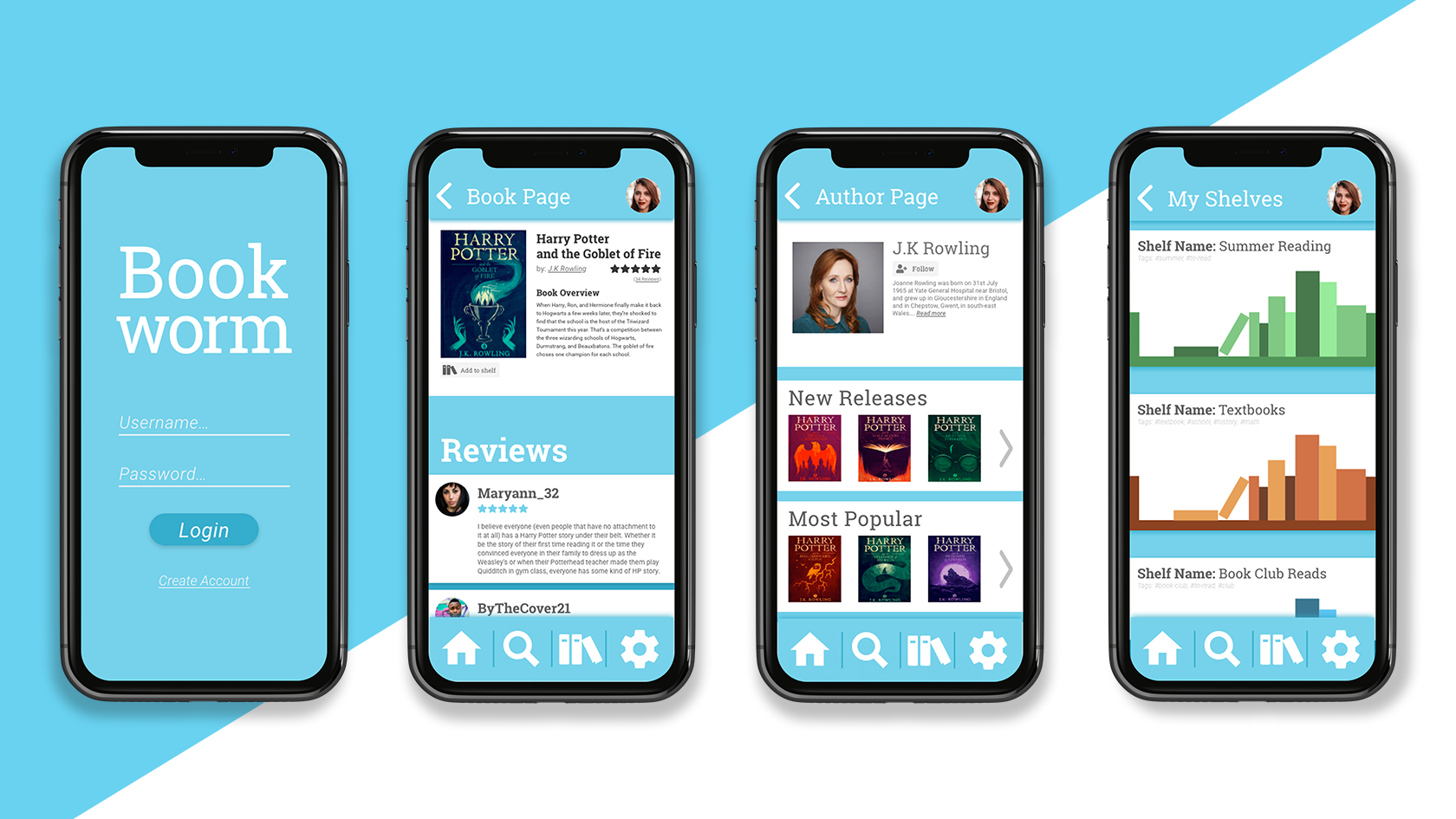
BookWorm
Over two different classes, we worked on creating the concept of an app we'd like to make, and the user experience behind it. Once we had the user data and lofi wireframes, we then worked on making a polished UI centered prototype in Adobe XD. I had the idea of making a bookshelf type app, where users would be able to not only save and organize all the books they've already read, but also quickly lookup and jot down the books they want to read in the future. I went with a more flat color minimalist look to my apps UI, keeping the color scheme to blue and white, which I felt would help draw focus to book covers on the app, and not make the user feel crowded.
- Skills: UI, UX, Design Layout, Branding, Concept
- Programs: Adobe XD, Photoshop, Illustrator
Chobani's Golden ticket Contest
We were tasked with coming up with a contest idea for a brand, and creating a landing page mockup for it, along with emails that would advertise the contest as well. I chose to create a contest based around the idea of Willy Wonka's golden tickets, but swapping the golden tickets out for golden foil lids found on Chobani yogurt, each lid could have a code the person could enter online for a chance to win multiple high priced prizes. I wanted to keep Chobani's style, but also play further into the golden part of the contest by making it feel more elegant and 'fancy'. I felt this project really helped me to better work out and think through website layouts that aren't just standard sites, and was also a good exercise in playing with a brand that has an existing style and not straying too far from their set standards.
- Skills: Web layout, Graphic Design, Typography
- Programs: Adobe Illustrator, Photoshop

