Seats: Forge Ahead
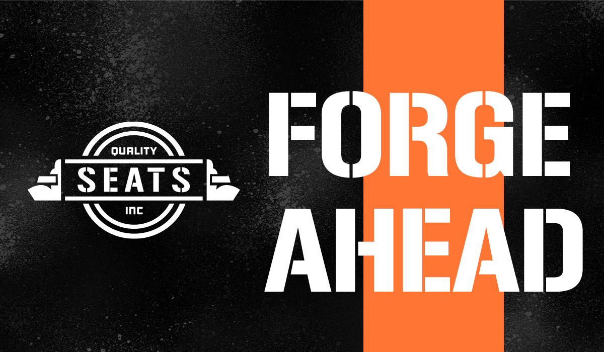
I started by breaking away from their original oval badge and creating a more industrial looking design. This company makes a variety of aftermarket seats for different utility vehicles so I wanted to incorporate that idea into the poster series and the social media squares. Their original “moving forward” felt important to the brand, so I decided to represent that in the never ending diagonal image treatment as well as the bar of orange that the “Forge Ahead” language sits on. The color palette was maintained from the original logo - orange, black and white to hold that industrial vibe. For the companion pieces, I wanted to do a redesign on a semi trailer, keeping the same feel of the grungy, speckled, dark-gray background with the diagonal line of orange, and the stark white logo. The shirt that I designed kept the truck drivers in mind with a more breathable fabric and it being a partial button up. For the office attire, the logo should be embroidered on the front.
- Skills: Type Refinement, Composition, Layouts, Photo Editing, Logo Design
- Programs: Adobe Illustrator, Adobe Photoshop, Adobe InDesign
Creative Mornings Project
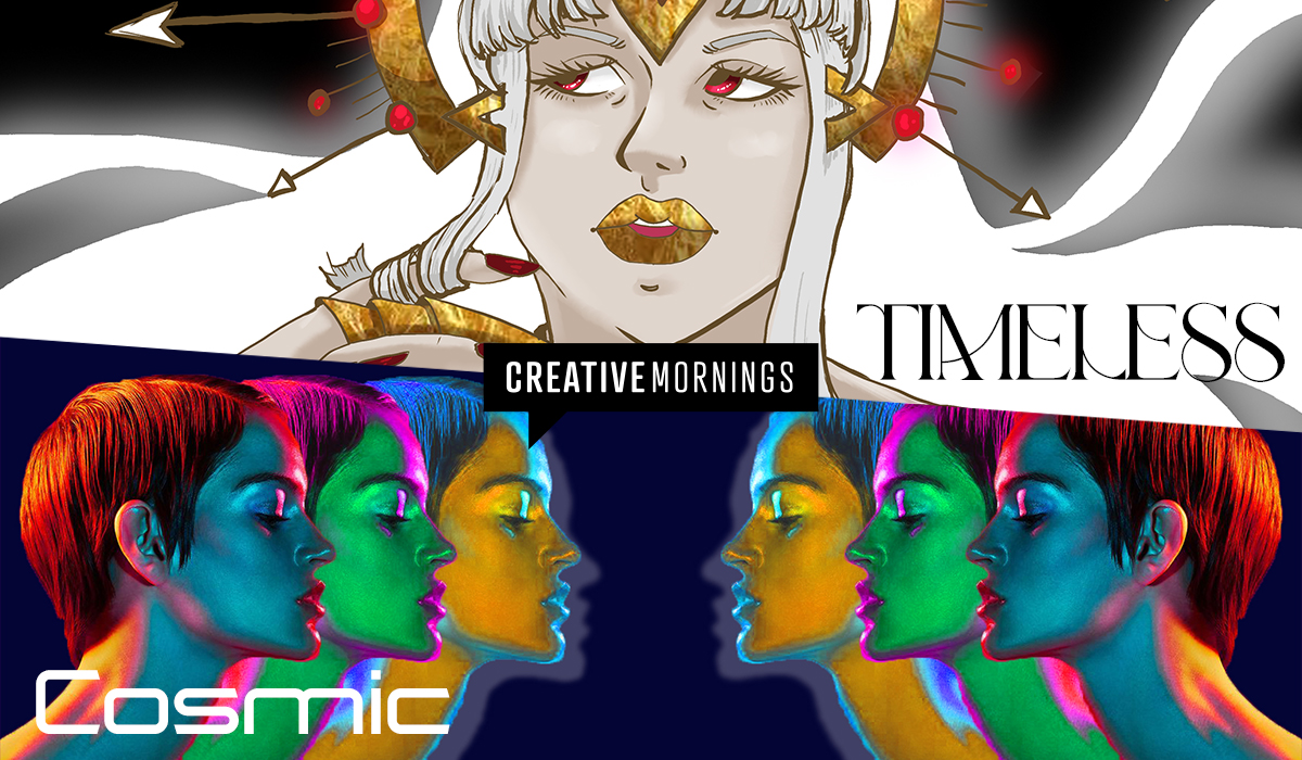
The Creative Mornings client project started with everyone picking a theme and creating a poster for it. This poster would then be transferred to our assigned partners and we would have to create a series of 4 social media squares and a website header for the traded poster. The theme I chose was Timeless and for that I created a time goddess holding an hourglass along with a headpiece that was influenced from a watch face that I came across. The whole piece was digitally drawn and colored in Adobe Photoshop. The other side of this project I had to create 4 social media squares for had the theme Cosmic. This theme was inspiring to me and was a pleasure to create pieces for.
- Skills: Project Management, Illustrative Design, Composition, Photo Editing
- Programs: Adobe Photoshop, Adobe InDesign
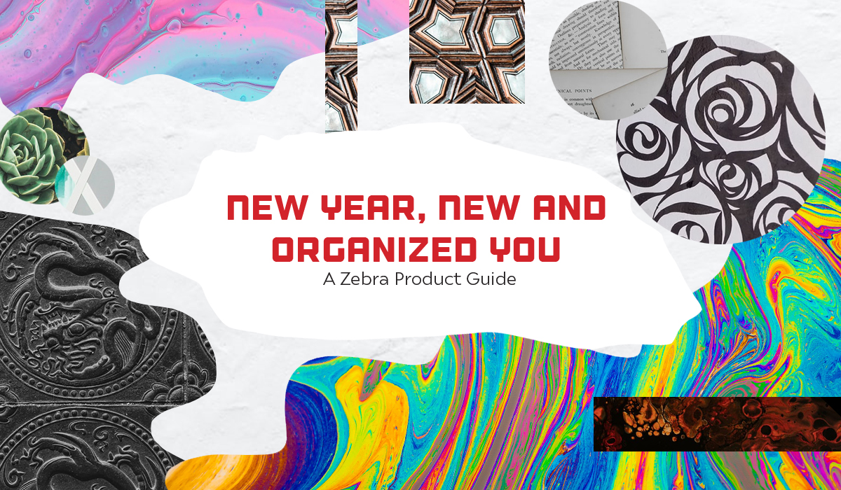
Zebra: "New Year, New and Organized You"
For this brochure, I wanted it to have a scrapbook/art journal aesthetic. It was a lot of fun exploring shapes of “cut paper” and “washi tape” for the page layouts, and how they would play off each other to create a cohesive design. The swatches for the pens and highlighters were done by hand and scanned in. In the spirit of creation and wanting to show the product’s versatility, I wanted to include a graphic of my own design colored in with the various Mildliners, however, to keep the piece clean and refined I used a digital mockup with the scanned colors of the Mildliners.
- Skills: Type Management, Composition, Layout, Color Theory, Photo Editing, Illustration
- Programs: Adobe Photoshop, Adobe InDesign
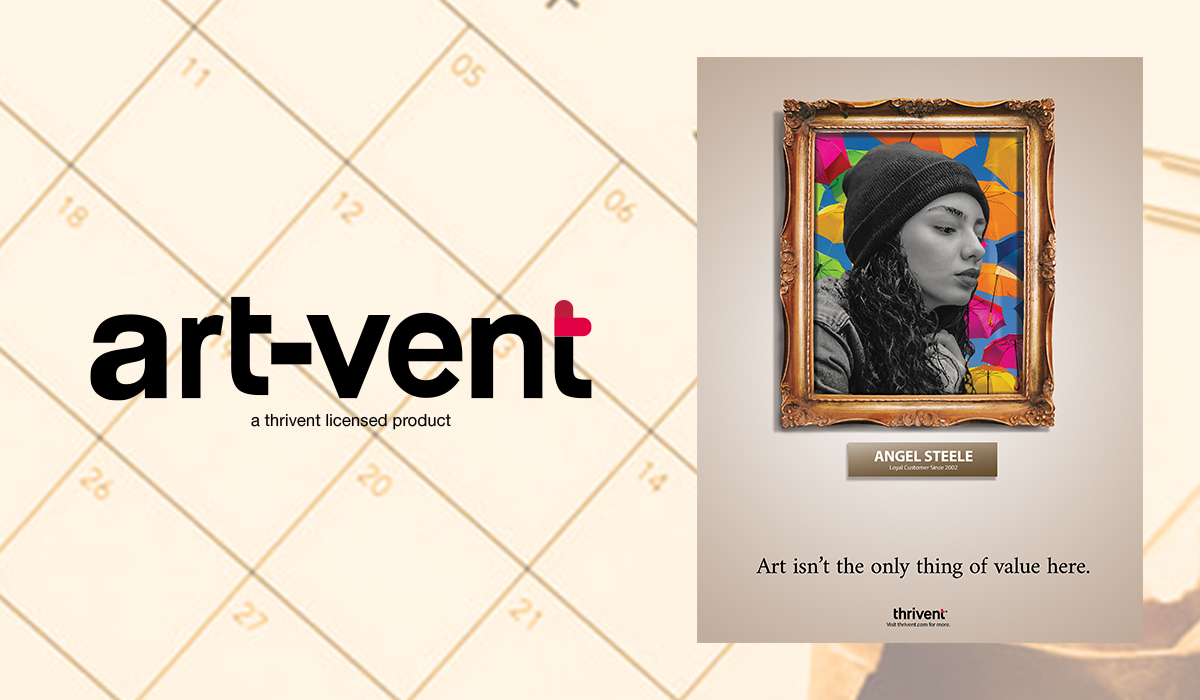
ArtVent
At first, I was stumped with having Thrivent as a client, but my goal was to make this insurance agency interesting for the public. While pursuing their website, I came across their in-house art gallery, which led to the design of ArtVent. It took a lot of trial and error before I finally came across an idea that stuck, which was creating an advent calendar style app that has various prompts based on things you would want to protect or insurance related things. The whole app itself was created in Adobe Illustrator with photos from Unsplash.
With the ad series, I wanted to take a step back from ArtVent and make a monument to Thrivent. I created 3 posters with a framed portrait of customers containing the message of “life is art, so we should protect it.” I finessed these photos to give them a certain texture as well as making them feel unique and bold. The final in-person piece will feature a mirror in a frame with the same message to show that anyone can be protected under Thrivent.
- Skills: App Design, Logo Editing, Composition, Image Manipulation, Layout
- Programs: Adobe Illustrator, Adobe Photoshop, Adobe InDesign
