Nik Petranek
Graphic Design & Illustration
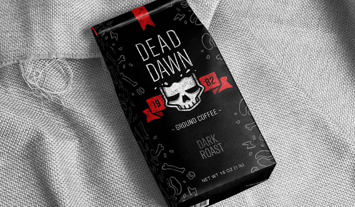
Dead Dawn
Dead Dawn is a coffee brand that focuses on waking your dead self during the break of dawn. The brand appeals to a younger demographic while wanting to remain intense and strong with plenty of branding and merchandise opportunities. This feeling is achieved through a very illustrative and grungy aesthetic.
- Skills: Illustration, Branding, Packaging, Logo
- Programs: Photoshop
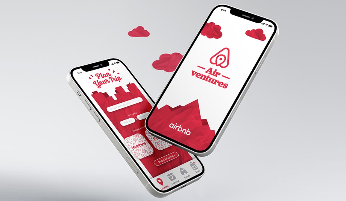
Airventures
Airventures is an app made by Airbnb to plan the destinations of your next trip to turn your whole journey into a vacation and adventure. The goal was to keep the aesthetic of the original Airbnb brand while making it feel more travel centric. This is achieved through keeping the same color palette and incorporating aspects of paper for maps and planning, and clouds for an open and adventurous feel.
- Skills: Mobile UI, Branding, Layout
- Programs: Photoshop, Illustrator
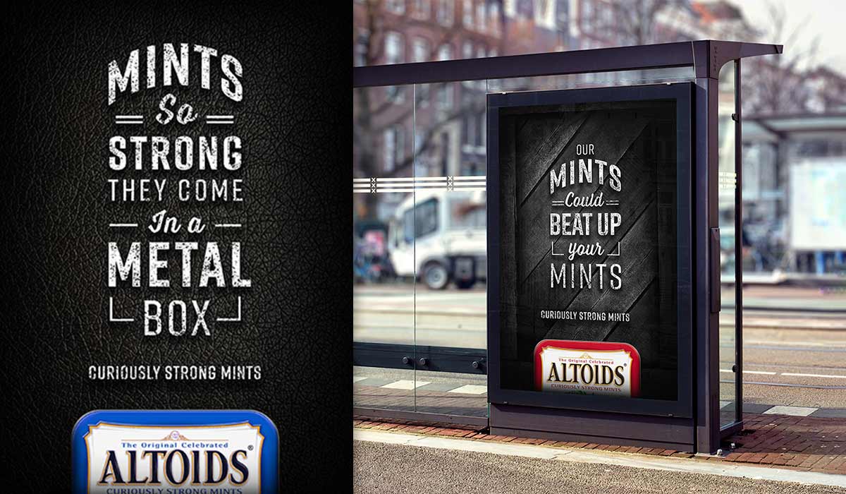
Altoids Ad
This ad campaign is meant to show off the rough and tough aspect of Altoids being curiously strong. This is done through bold contrast and gritty texture, along with focusing on type to present a strong and direct message.
- Skills: layout, typography
- Programs: Photoshop, Illustrator