Alec Mattie
Visual Communications
Demo Reel
This is my demo reel, a compilation of some of my favorite shots and moments from the projects that I've worked on.
- Skills: Animation, Cinematography, Editing
- Programs: Adobe After Effects, Adobe Premiere
How to Survive (Grizzly) Bear Attacks
Although I have never encountered a bear in the wild, I do enjoy going to parks, so it was very enlightening for me to research and consider the various ways that a person could avoid being attacked by one. The NPS (National Park Service) has a lot of information about park safety, so I thought PSA utilizing motion graphics would be perfect for them. The concept I came up with was inspired by signs you would see on the road and in parks, with the kinetic approach mimicking the urgency that would arise in such a situation. I decided on using earth-tone colors, such as the two different shades of green, to invoke the imagery of parks. The orange became a wonderful contrast and implied a sense of warning or hazard that one should avoid. I wanted the assets to exit offscreen as if they were being pushed aside, rather than disappear entirely, like a slideshow that one would watch before venturing out into the wild. This approach resulted in an energetic PSA that is both fun and educational.
- Skills: Storyboarding, Composition, Animation
- Programs: Adobe After Effects, Adobe Illustrator
Join WWOOF Today!
This animation was created to promote the WWOOF (World Wide Opportunities on Organic Farms), which, as the name implies, offers volunteers the opportunity to work on organic farms around the world. The main goal was to emphasize a fun environment in which volunteers could gain experience and learn more about organic farming. My concept began with the aim of mimicking paper cut-outs, which morphed into the idea of using photographs. To this end, I utilized thick white outlines applied with a stop-motion aesthetic to give the impression of paper being moved around. The sky-blue background became the foundation of my piece, being a natural companion to the organic greens that one would encounter when farming. When considering the way that information would be conveyed for this concept, I decided on having a narrator, or “mascot”, acting as the sender. This gave me the idea of using a goat as the mascot, as they are well-known grazers in the farming world. The result is a bright and vibrant promotional piece that showcases what the WWOOF is all about.
Dead Broke – A Short Film
Out of all the different avenues by which one can express themselves through art, film is by far my favorite. So, it was an absolute pleasure to conceptualize and shoot my first short film, the appropriately titled Dead Broke. While the themes of the film involve friendship, forgiveness, and recognizing the faults of oneself, it is primarily a comedic piece that delves into absurdity. As the director, cinematographer, and editor, it was of great importance to spend time developing the treatment, screenplay, and storyboards. This preparation, combined with actors that did a wonderful job bringing my characters to life, provided me with the great opportunity to utilize various shooting techniques such as match-cuts, shot/reverse-shots, eyeline matches, and a multi-camera setup. While acting as director, I also handled the sound recording as well. In post, I applied various foley sounds to further emphasize the absurdity of the film. In conclusion, I believe this goofy little comedy granted me a priceless opportunity to hone my skills as a filmmaker, and I look forward to making countless more films in the future.

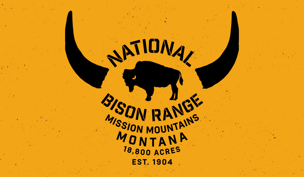
National Bison Range Badge
The American Bison, also known as an American Buffalo, has always been one of my favorite animals. Because of this, the National Bison Range in Montana has always been in my top places to visit. Having such a long history, including near extinction, I wanted to make a badge that exemplified just how tough these creatures are while also promoting the long-lasting legacy of the reserve itself. I went with the idea of having a wood-like, natural aesthetic, as if it was carved into a wooden sign. I used the type itself to create the head of a bison, along with a stencil-like font to further the wood theme. This, combined with the black horns and black bison in the middle, creates a nice contrast with the type and gives more clarity to the piece itself.
- Skills: Composition, Design, Typography
- Programs: Adobe Illustrator
