Graphic Design & Illustration
Fernanda Loaiza
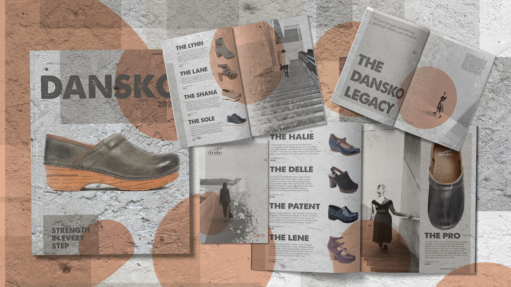
Dansko Catalog
Danskos are my favorite shoes. I find them very reliable so, I wanted to convey a sense of strength and durability by incorporating different concrete textures and setting it in an urban environment. Adding the photographs and orange circles created a touch of comfort and warmth to soften it up.
- Programs: Photoshop, InDesign
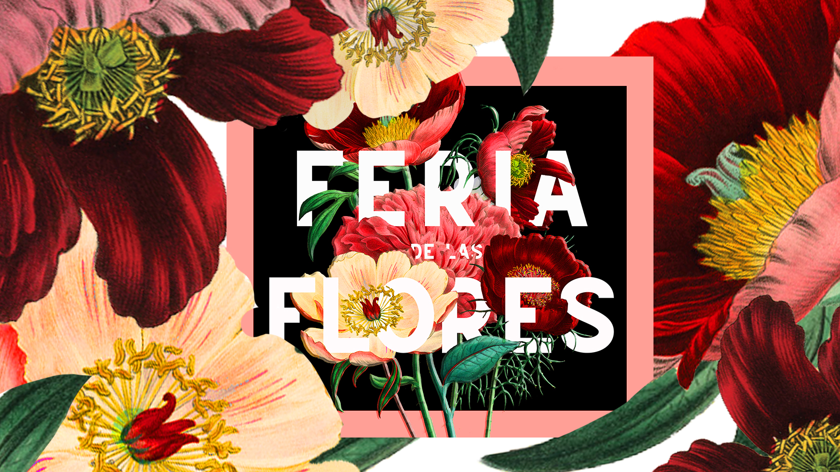
FERIA DE LAS FLORES
La Feria de las Flores is an annual Colombian festival that celebrates flower farmers and their craft. Besides the flower displays, there is an antique car motorcade and a fine horse parade. The festival has been happening since 1963, so I chose vintage flowers to convey an older look. I wanted to make the flowers the center of attention, therefore I added a dark background to make them really pop. After all, it is all about the flowers.
- Programs: Photoshop, InDesign
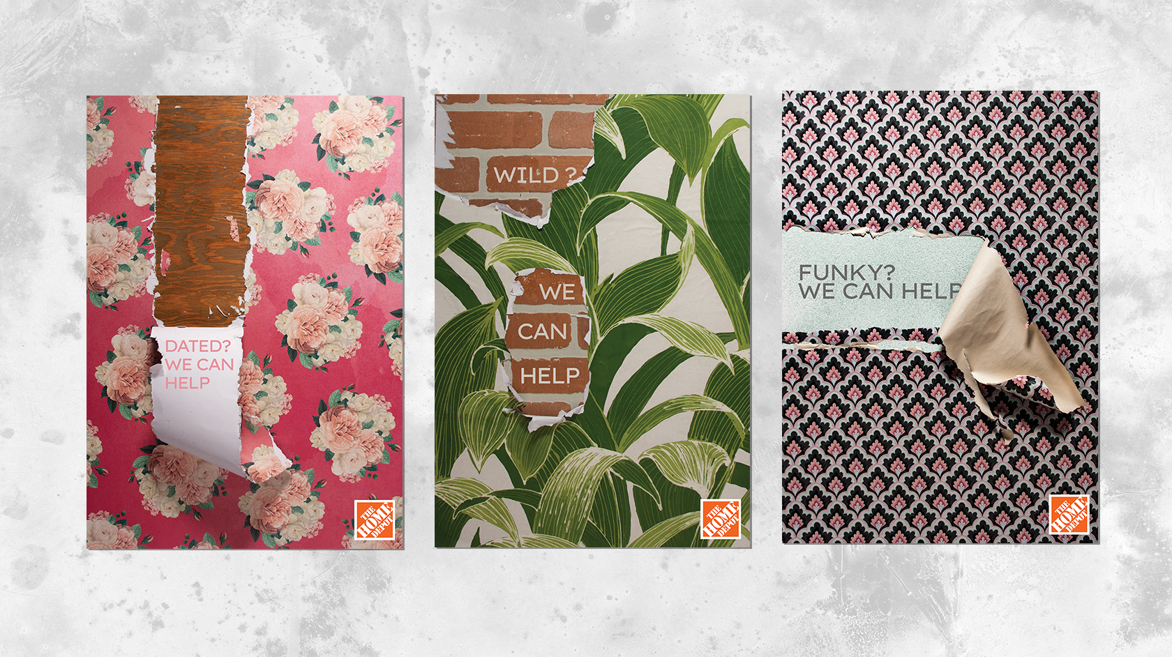
Home Depot Remodeling Campaign
I wanted to create something with my hands, so this project was a great idea. I built the walls, peeled the wallpaper off, and then did the photography. I chose Home Depot because I find it to be a company that would utilize funky, wild and bold advertisement, while still delivering a straight-forward message.
- Skills: Concept, execution, photography, layout.
- Programs: Photoshop
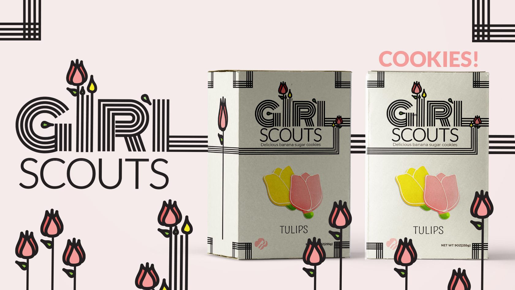
Girl Scouts New Cookie
Girl Scouts aim their efforts at noble causes of global importance, I imagined a new cookie that would be specially sold for Earth Day with profits donated to charity. The Girl Scouts are fun and energetic, that is why I chose a font with lots of personality but not childish, I felt that giving it more maturity would create a sense of being trustworthy, I added other illustrative elements to create a more dynamic environment.
- Programs: Illustrator, Photoshop
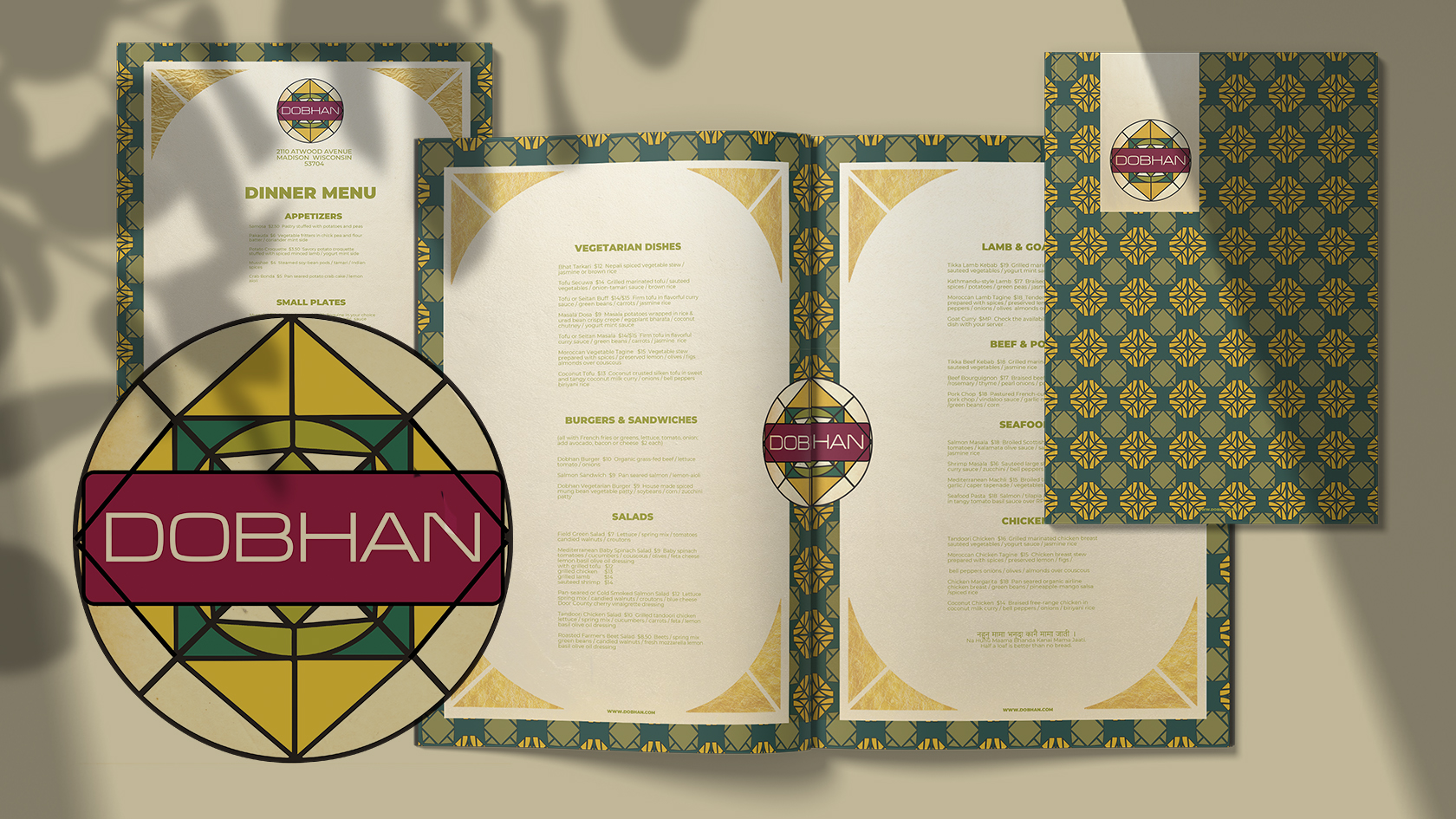
Dobhan Logo and Menu
Dobhan is a Nepalese restaurant that appeals to adventurous individuals, travelers and foodies alike. I was inspired by their colorful and eclectic style that feels energetic and bold, I used the familiar design that is the mandala to combine different elements of their geometry, creating a more visually engaging identity all while remaining authentic.
- Programs: Photoshop, Illustrator


