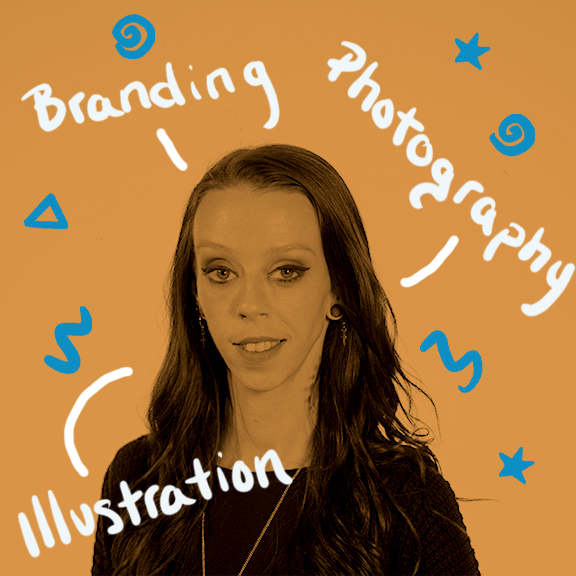
Graphic Design & Illustration
Tabatha A. Bird
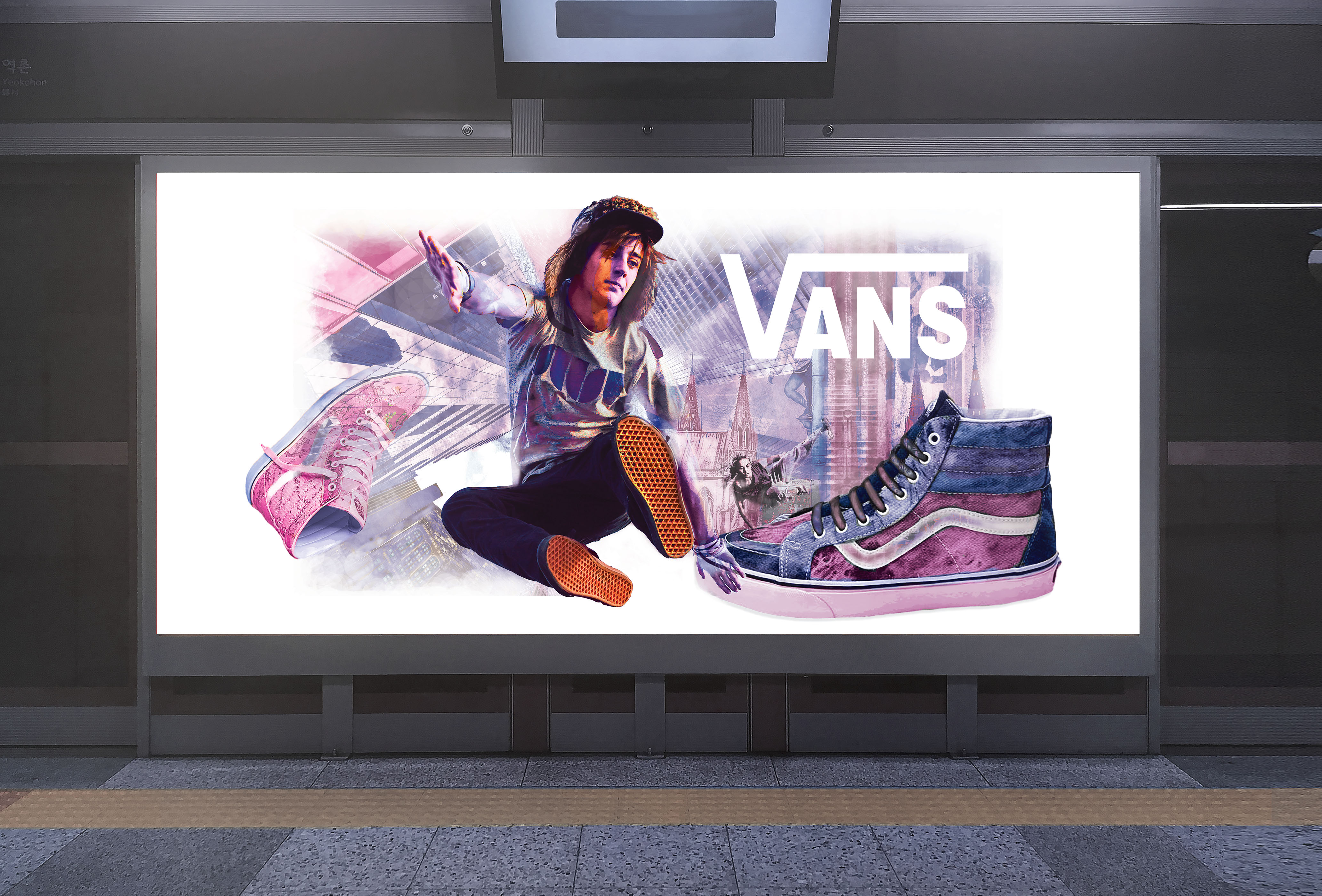
Van's Parkour Advertisement Graphics
The concept behind this piece was essentially to create an advertisement for a well-established brand that moved their product into a new avenue. In this case, I choose to take Vans out of skate culture and into parkour. Visually this is represented by the use of perspective and the choice to create a scene in an environment high above the city streets where the most extreme of parkour practitioners showcase their dare-devil like skills. This ad creates an opportunity for the viewer to see our shared world with new eyes. The chosen, limited color scheme that is both subtle and vibrant draws the eye into the image and guides you through the composition allowing you to see the multi-layered architecture and the other figures within the frame. My goal was to keep the focus on product while also showing the potential for a new, untapped consumer base in the world of parkour and free running.
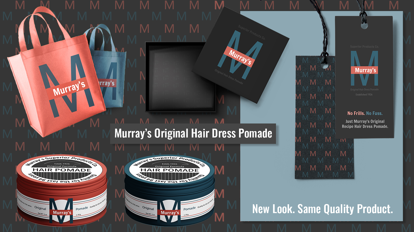
Murray's Brand Re-Design
Murray's Original Hair Dress Pomade has been around for over 94 years. All the while, the face of the company and brand identity has never changed. Their look is loud and outdated. Time for change was desperately needed. I wanted to bring them into the present and update their visual brand to a cleaner aesthetic with a limited, gender-neutral and more conservative color palette. The visual concept is focused on typography over graphics. This is a functional, no-frills product that needs a strong yet simple logo and style that inspires thoughts of dapper young men and women with great hair and style.
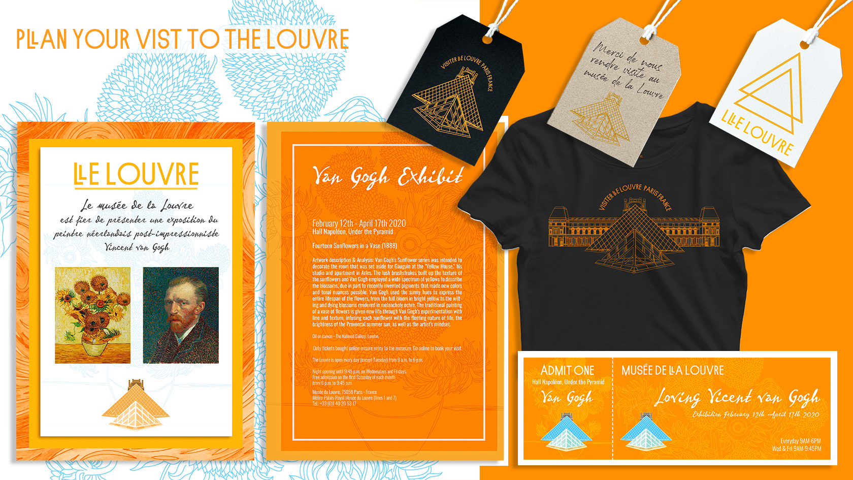
Louvre Museum Logo Redesign & Event Invitation
What started out as an idea for a travel badge and logo redesign evolved to include promotional materials for an exhibition. Initially, I illustrated the logo graphics focusing on the iconic visuals associated with the Louvre Palace. The main logo features the glass pyramids with part of the palace roof silhouetted in the background. There is an alternate logo illustration that is detailed, line-art only and can be used for larger-scale promotional material as needed. In addition to a logo refresh, this project has promotional material including an invitation for an up-and-coming Vincent van Gogh exhibition.
- Skills: Logo Redesign, Vector Graphics, Illustration
- Programs: Illustrator, Photoshop
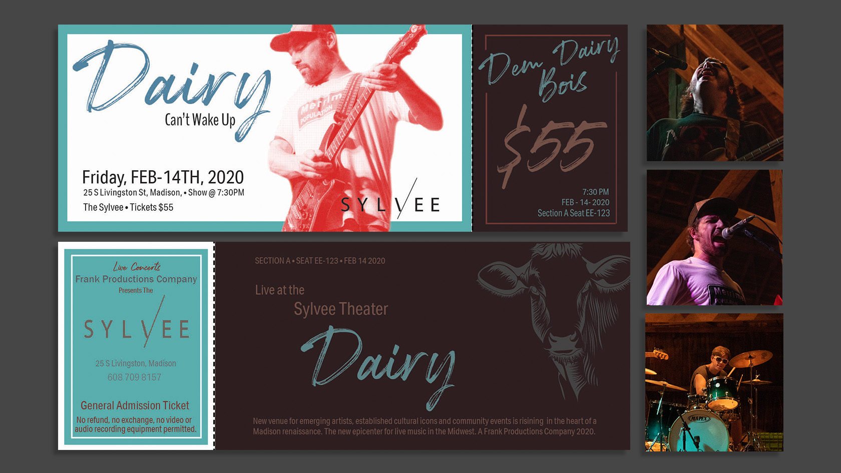
Dairy Concert Event Ticket
In-progress brand design project for the local alternative-band, Dairy includes concert event ticket layout and concert photography. To see more of this on-going project please visit my portfolio site: designtabs.myportfolio.com
- Skills: Layout, Photo Editing, Branding
- Programs: Photoshop, Illustrator, Indesign

Photography Compilation
Photography short including recently taken landscapes and portraits.
- Skills: Photography, GIF Making, Photo Editing
- Programs: Photoshop, Bridge


