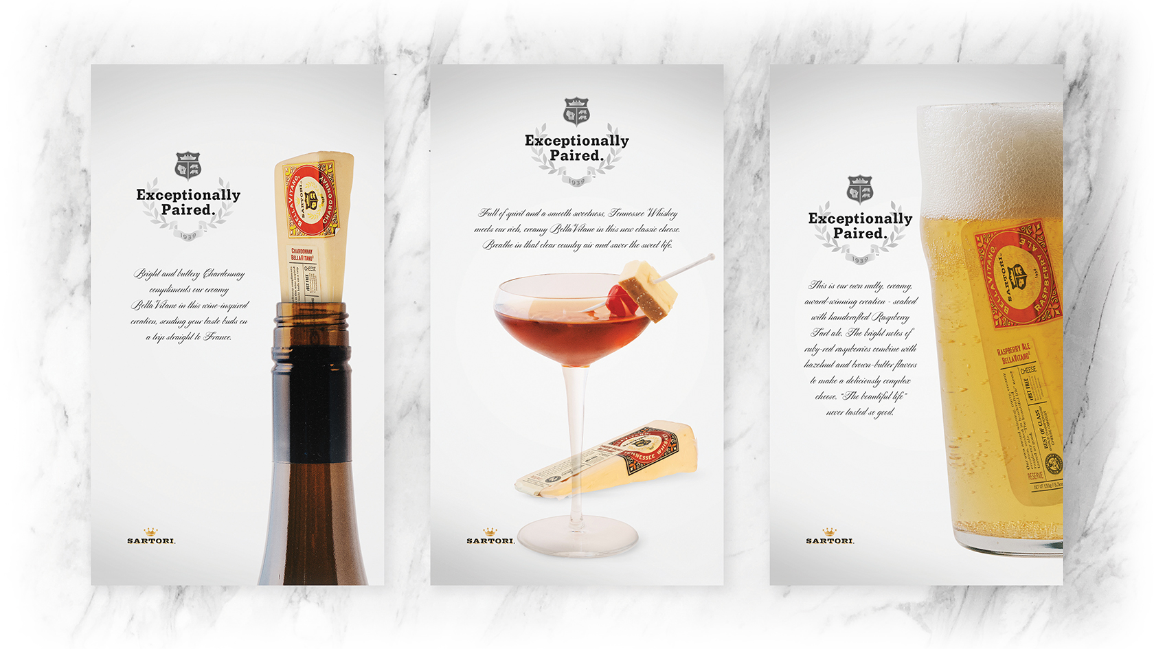
Sartori Cheese Ad-Series
For this ad series, I wanted to create visuals pairing selections of Sartori’s cheeses with their paired beverage. I wanted the wedges to be incorporated in each photograph. Minimal images were used to focus on the product and to highlight the typographic elements. I chose a slab-serif font to best display the headline while I chose a script font to create a sophisticated feeling for the description of each cheese variety.
- Skills: Photography, Layout, Typography
- Software: Adobe Photoshop
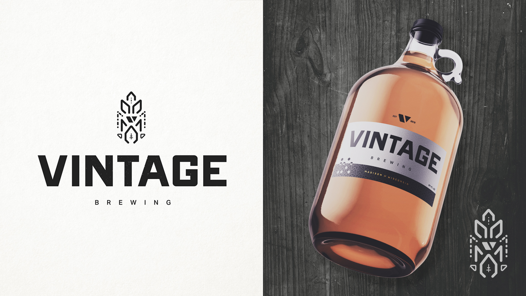
Vintage Brewing Company Branding
In rebranding Vintage Brewing Company, my goal was to elevate the brand and create a more contemporary identity for a well-known brand in the Madison area. I wanted the brand to appear modern and refined, yet approachable and classic. A fusion of different influences, complimenting one another to create an identity that is bold but inviting. The hop icon is a vector graphic that is used throughout the branding, and is key to their new modern identity. The bold, sans-serif typography lends itself to Vintage’s new clean and contemporary image. More branding applications are showcased on my personal website, including printed materials, apparel, and a homepage design.
- Skills: Brand Identity, Digital Illustration, Layout, Typography
- Programs: Adobe Illustrator, Adobe Photoshop
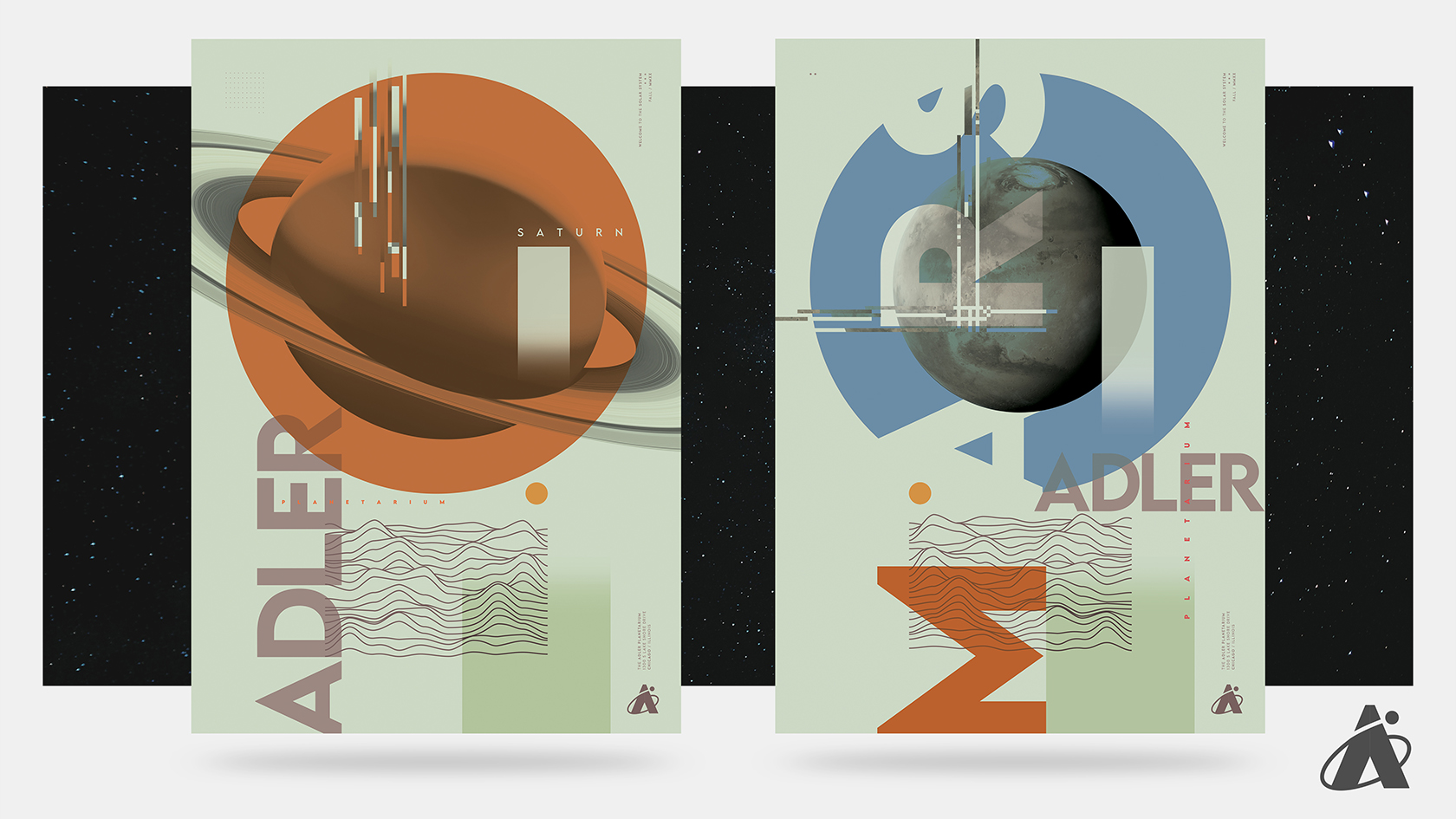
Adler Planetarium Poster Design
I envision my poster designs to represent an exhibit showcasing and educating its audience on each of the planets in our solar system. I wanted to instill a scientific and calculated aesthetic that featured a film-inspired color palette. Each piece is meant to convey the relationship between our home planet and others, continually developing our understanding of our stellar neighborhood.
- Skills: Layout, Typography, Digital Illustration
- Programs: Adobe Photoshop, Adobe Illustrator
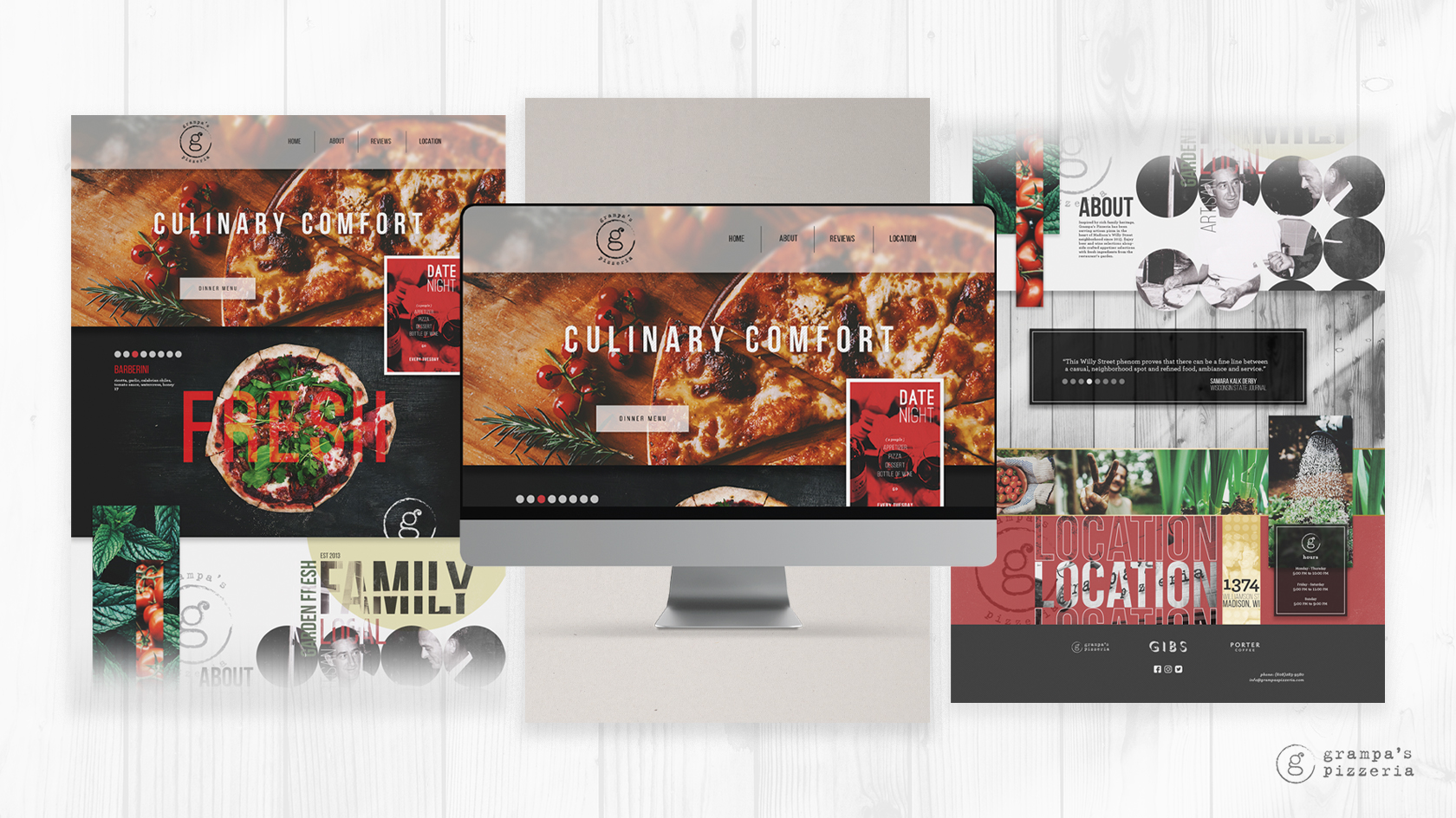
Grampa's Pizzeria Homepage Design
When designing the home page for Grampa’s Pizzeria, my main goal was to build upon the brand’s reputation for a family centric atmosphere with fresh, quality dining options. I intended for the page to feel more like an experience instead of a static web page. I wanted the typography to have just as much of an impact as the images, and wanted the two to compliment one another while communicating the brand’s identity. While I wanted each section to contrast from the one before, I wanted to ensure a sense of visual harmony from top to bottom.
- Skills: Web Design, Photo Editing, Layout
- Programs: Adobe Photoshop


