Coalesce
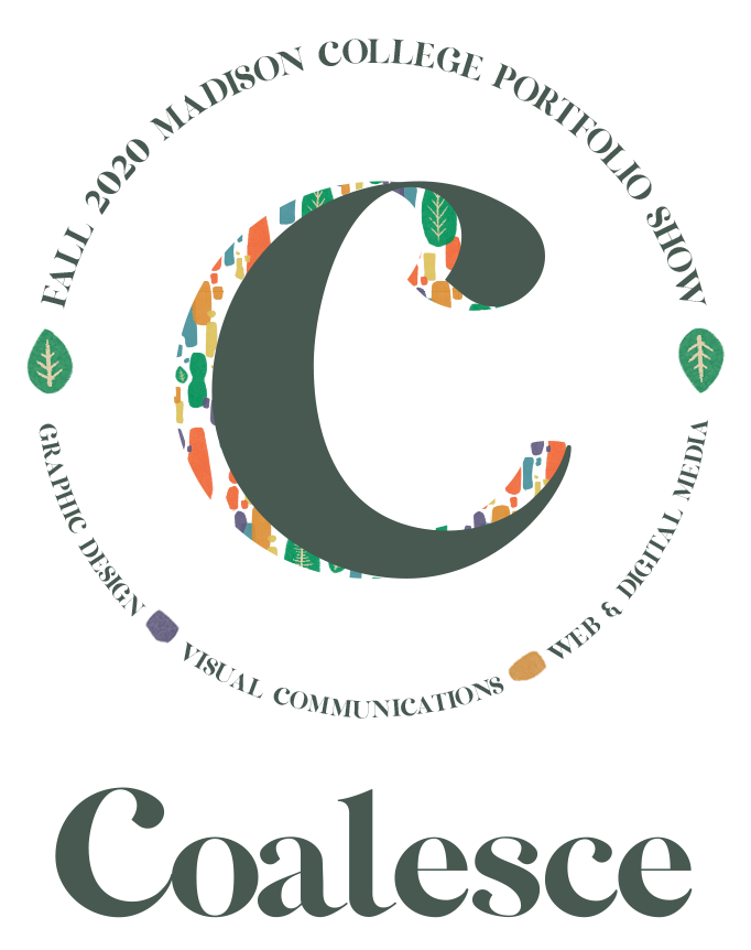
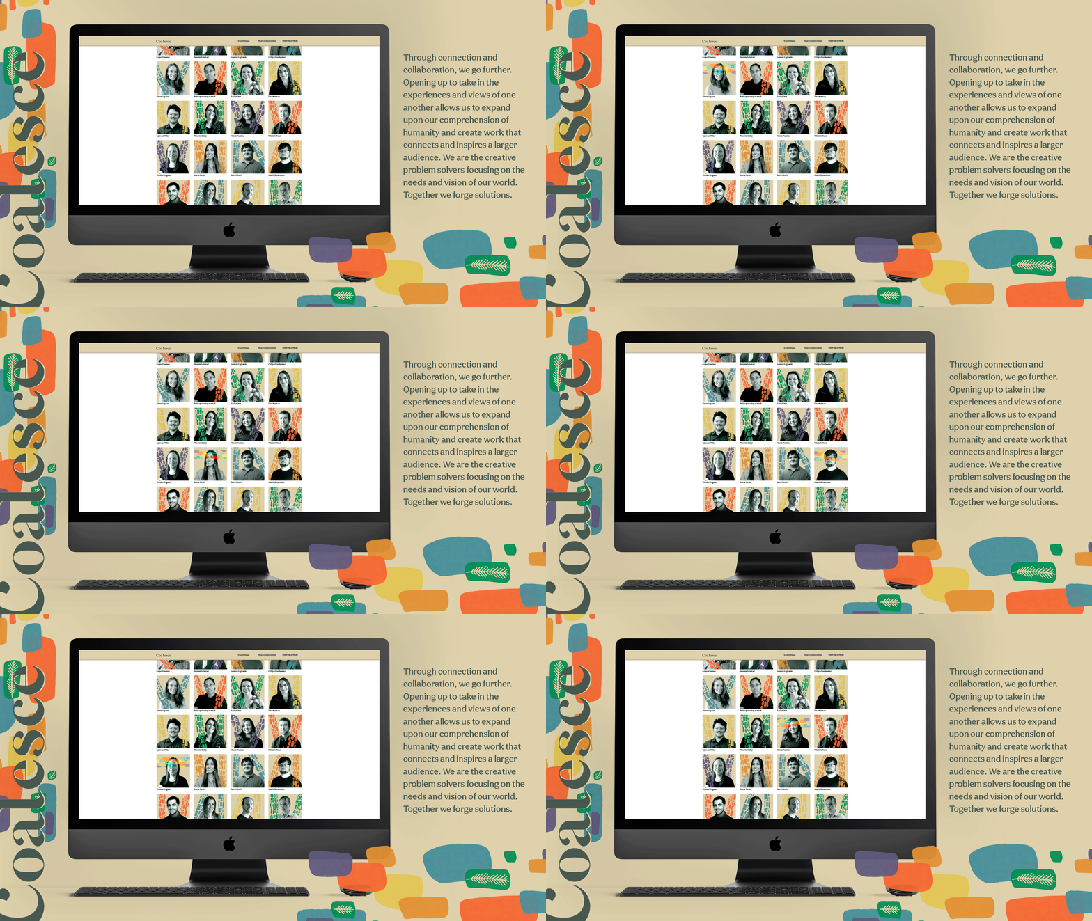
During my final semester in the Graphic Design program at Madison College, I had the opportunity of concepting and directing the branding for the fall 2020 virtual portfolio show. The goal was to center the realities of our society and pose the question, “how can we use our creative skills to help the world work better?” My hope is to encourage others to embrace vulnerability so we may be open and honest with others in order to find true, meaningful connection and radical solutions. My team and I collaborated to developed a variety of assets including typography, illustration, photography, web and social media, copywriting, and motion graphics.
- Skills: Concept Development, Creative Direction, Typography, Photo Treatment, Copywriting
- Software: InDesign, Photoshop
New Fashioned Sobriety
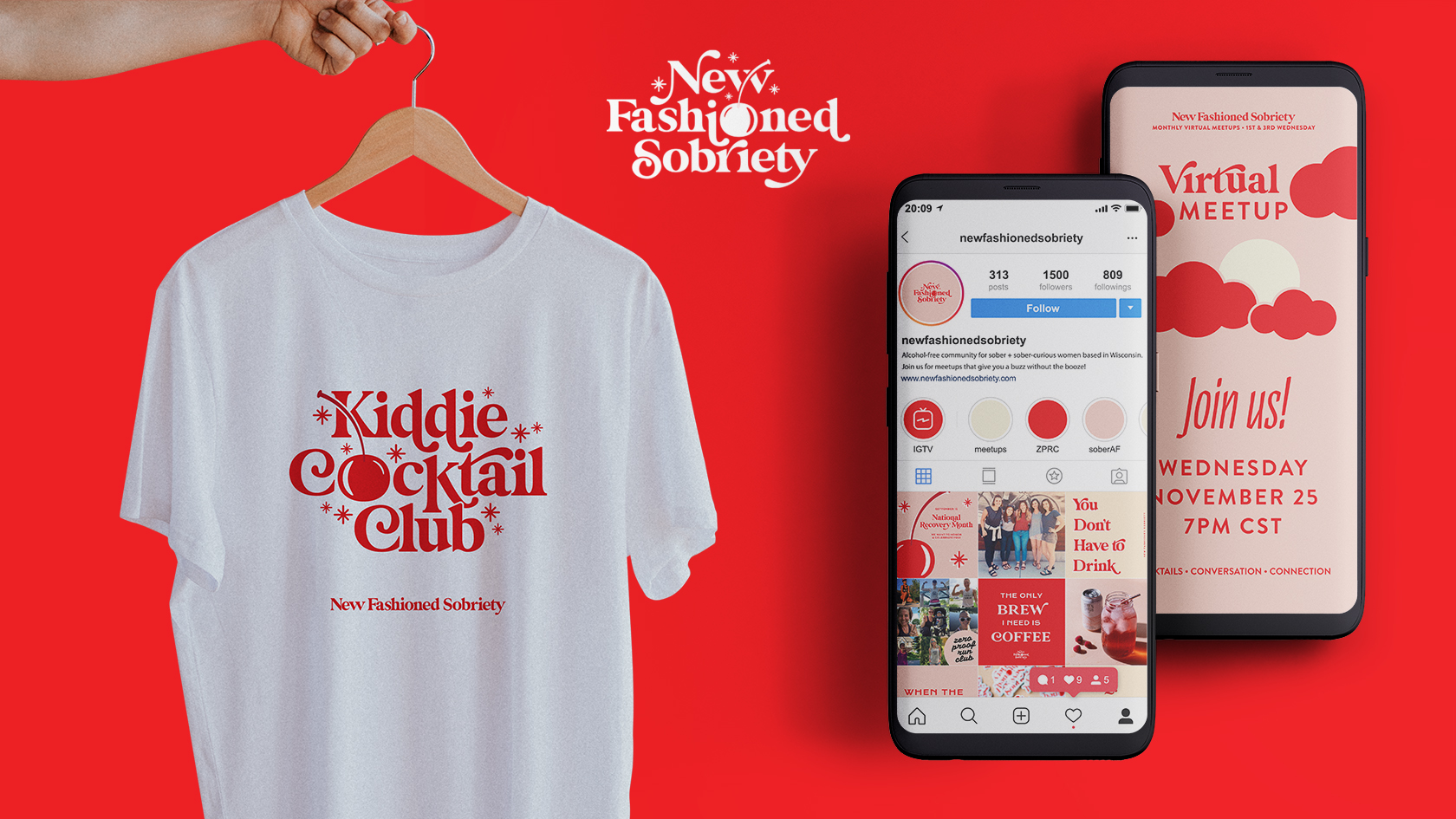
For my Honors Project in spring 2020 I designed the branding, identity and merch for an alcohol-free community for sober and sober-curious women. The collective was co-founded by my friends Sarah and Jenny and I. There is nothing boring about a sober life and the goal was to create a visual identity that communicates that. Ironically, the collective’s name was inspired by Wisconsin’s most popular cocktail: The Old Fashioned. By putting a new spin on something classic and incorporating themes of modern sobriety, a bright and inviting identity was created. The growing community of beautiful sober and sober-curious people are the cherry on top.
- Skills: Branding and Identity, Logo Design, Social Media Assets, Illustration, Merch Design, Copywriting
- Programs: InDesign, Photoshop, Illustrator, Procreate
Hero's Journey Coffee Co.
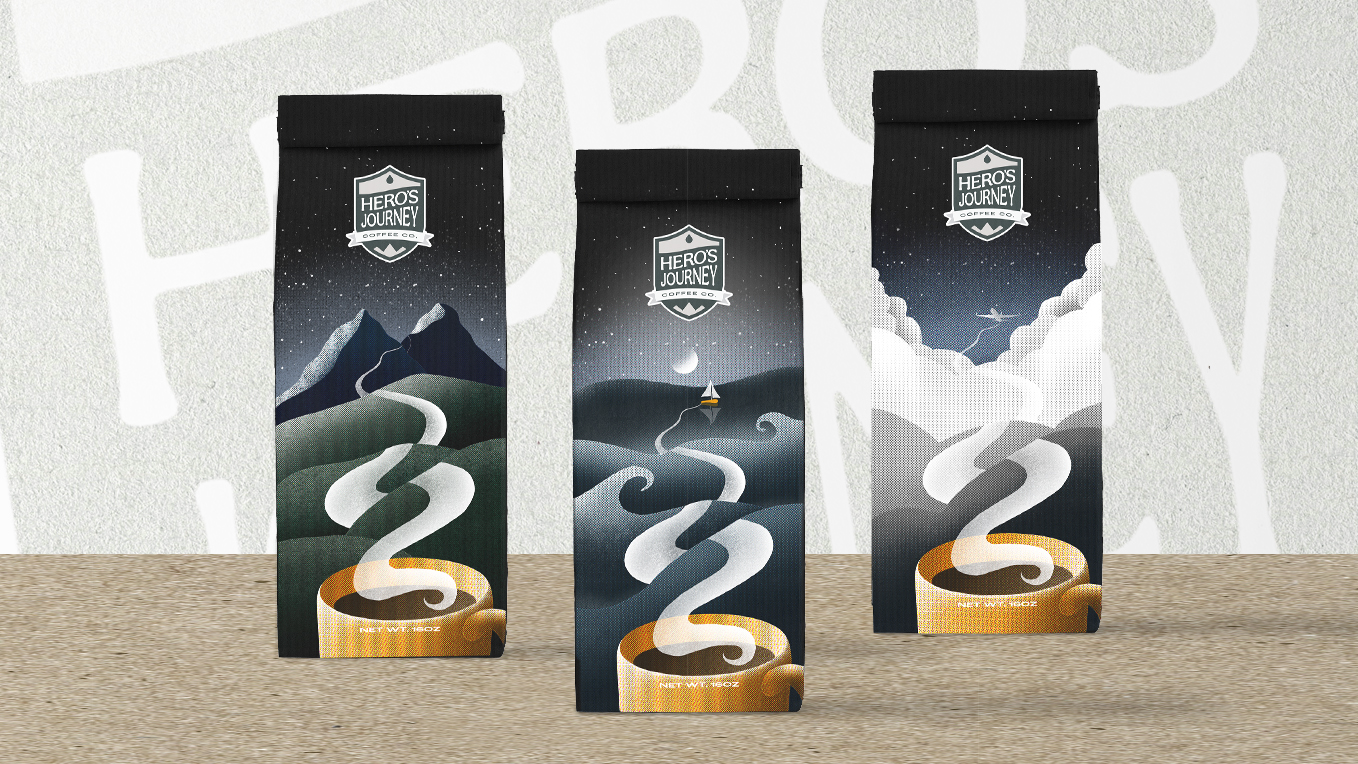
Hero’s Journey Coffee Co. is a fictional brand, handcrafted with warriors in mind. From departure to return, whether it’s setting off to work a 9 to 5 or a hike on the Ice Age Trail, this Go Juice is fuel for the journey ahead.
- Skills: Digital Illustration, Logo Design, Packaging
- Programs: Procreate, Illustrator, Photoshop
Ditched the Drink Logo Design
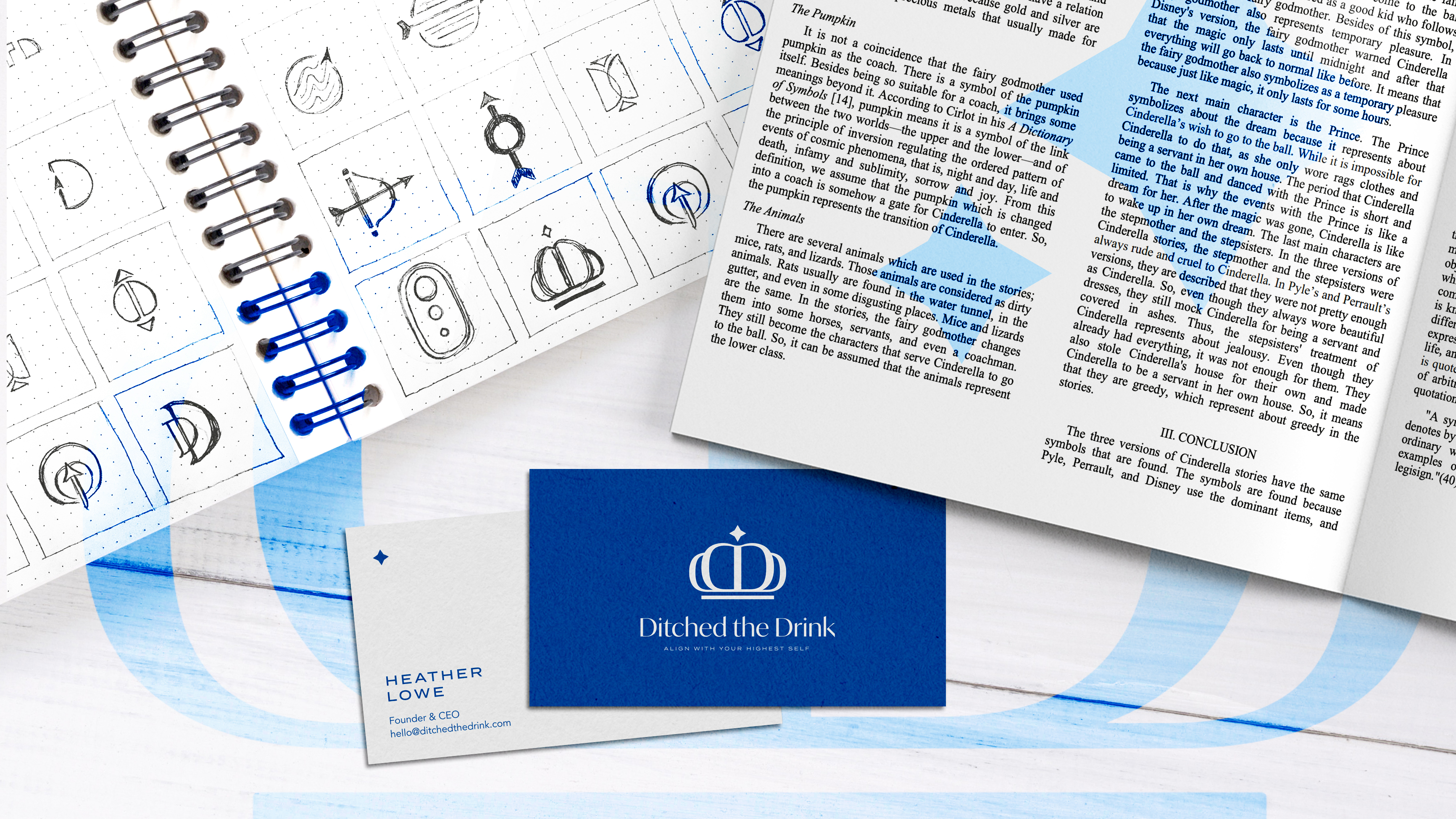
Logo design for Ditched the Drink, a health and wellness brand that offers online recovery coaching and workplace wellness consulting. Through repetition, the letter form 'D' shapes a dynamic crown that feels empowering, but is also as welcoming as a soft pillowy cloud. This crown is a visual representation of aligning with the highest self. The design also includes a burst at the top to represent one's north star and guiding light. The crown also appropriately resembles a pumpkin, which alludes to the gourd that transitions into a carriage in the fairytale Cinderella. In the book "A Dictionary of Symbols" written by Juan Eduardo Cirlot, he states that a pumpkin symbolizes the link between two worlds, which aptly relates to our lives before and after we quit drinking. The pumpkin represents Heather's encouraging and uplifting coaching program, which is the carriage that supports other's intrepid journey in recovery.
- Skills: Concept Development, Logo System Design, Copywriting
- Programs: Illustrator
Maple Bluff Country Club
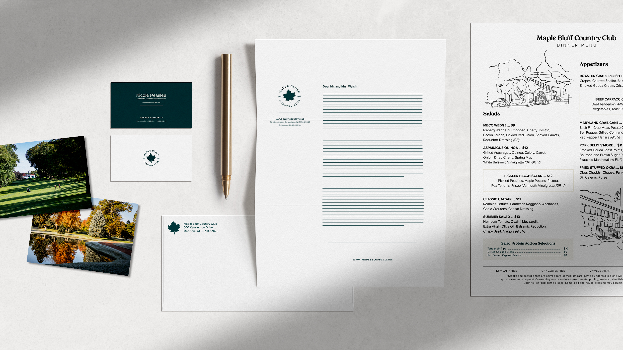
I’ve learned a lot about marketing and graphic design during my 6 years at Maple Bluff Country Club. This job was the catalyst to pursuing my degree at Madison College. During my time at the club, I contributed to the development of consistent branding with a complete overhaul of the logo, print and email marketing, social media, website, photography, and dining menus. Working with a team of seasoned professionals on strategic planning sessions taught me what it takes to create a value-driven, easily recognizable brand and how to effectively spread those brand values to the target audience.
- Skills: Logo Redesign, Print & Digital Collateral, Social Media and Email Marketing Management, Illustration, Photography
- Programs: Photoshop, InDesign, Illustrator


