Graphic Design & Illustration
Nikki Nicholson
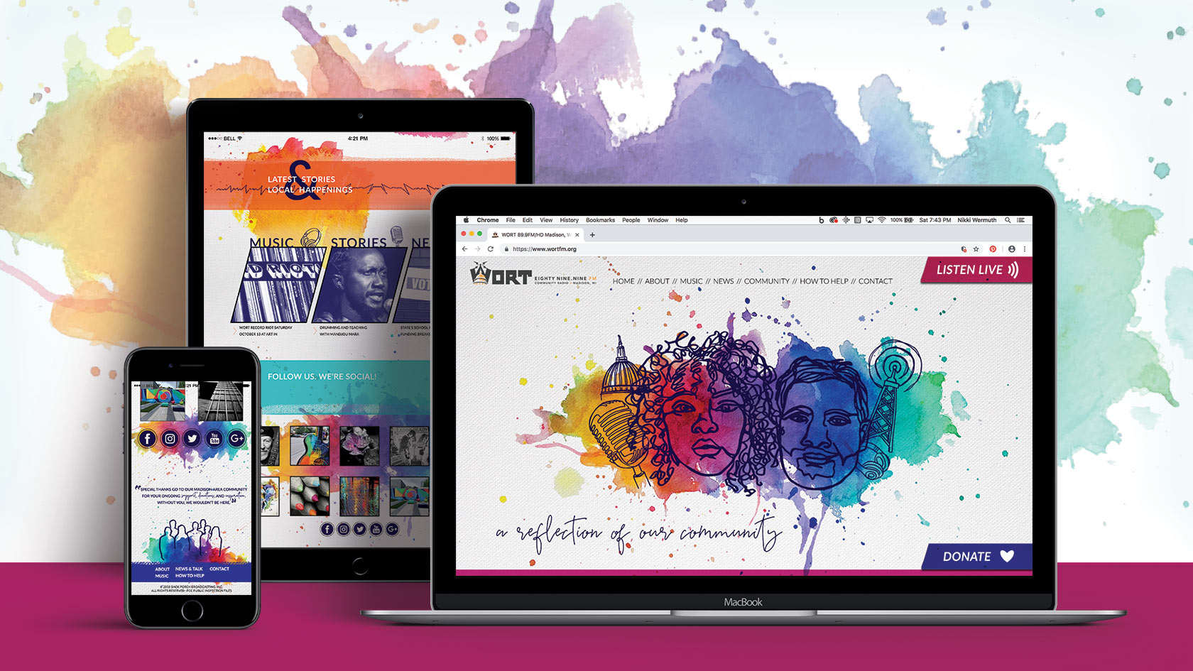
WORT 89.9 RESPONSIVE WEBSITE DESIGN
I ventured to redesign the website for WORT 89.9 FM because their existing branding did not best reflect their mission and business. I was most inspired by the part of WORT’s mission that states they, “shall serve a broad spectrum of the community by... including audiences and programmers under-represented by other media.” I wanted to play up this goal by using handmade, textural elements with a vibrant feel in my design. The best part of this project was getting my hands dirty by making physical assets. I love working at the intersection of handmade authenticity and digital precision.
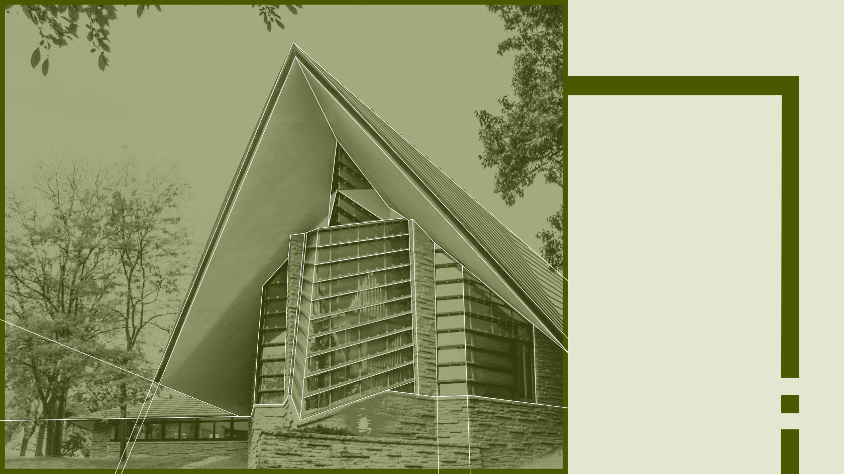
FRANK LLOYD WRIGHT FOUNDATION DONOR GIFT
The Frank Lloyd Wright Foundation (FLWF) thrives, in part, thanks to the generosity of its donors. I dreamt up this distinctive piece as a way for the FLWF to show their gratitude as well as incentivize future giving. The structure of this piece is a hand-crafted wooden box with individual panels that pull out, like a box set. Each panel highlights a Frank Lloyd Wright (FLW) landmark in Wisconsin and a particular tenet of FLW’s philosophy. The beauty, craft, and detail of this keepsake will resonate with donors, those architecture and FLW enthusiasts, and serve as a unique treasure for years to come.
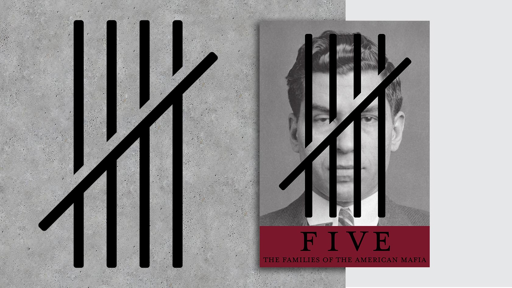
FIVE: MUSEUM EXHIBITION BRANDING
FIVE: THE FAMILIES OF THE AMERICAN MAFIA is an immersive exhibit which chronicles the origins and history to date of the American mafia with its roots in New York City. Visitors are provided a glimpse into organized crime, centrally focused on “The Five Families,” as they began and as they operate to this day. My favorite part of this project was coming up with the logo design, trying to cast a net over all of the ways one could possibly represent “five” and narrowing in on the most powerful, memorable imagery.
- Skills: logo design // concept // branding
- Programs: Illustrator // Photoshop
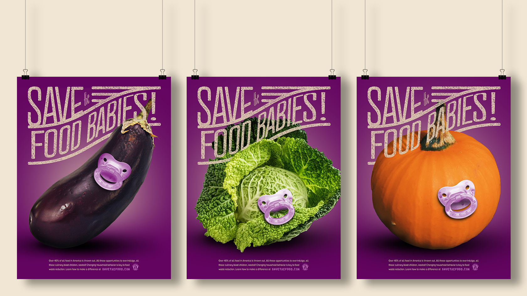
SAVE THE FOOD PSA SERIES
I put together this series to help spread the word about food waste prevention. A successful poster is one that grabs the viewers’ interest and pulls them in to take a closer look; these strange little veggie babies do the trick! Hopefully you are familiar with the term “food baby,” that is, a protruding stomach caused by eating a large volume of food, and can therefore appreciate the tragedy of having to throw away spoiled fare that could have otherwise been consumed to excess. I loved being able to use humor with this series as a way to grab attention and spread an important message.
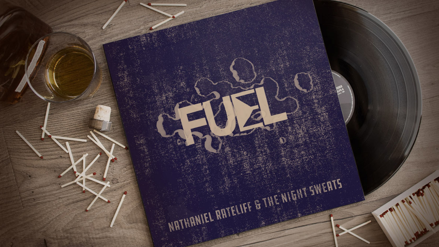
NATHANIEL RATELIFF’S NEXT ALBUM
This beauty is what I imagine for Nathaniel Rateliff’s next album cover. He is a man of heart and soul, is impossibly light on his feet, and he performs every show as if it’s his last. I wanted to create something that felt tactile, like you could feel that texture and smell that bourbon. I photographed the “FUEL” image by placing type I designed under a pane of glass with water droplets on top. I also arranged and photographed the vignette scene to help this album design come to life.
- Skills: concept // photography
- Programs: Photoshop

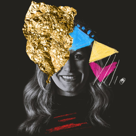
WE ARE ALCHEMISTS.
We take raw elements like light & shadow, 0’s & 1’s,
time & sound, line & color, and make them communicate.
We create, we transform.
We make people feel, learn, think, sit up, and pay attention.
We are brilliant, talented, and skilled.
We are alchemists.
WE ARE GOLDEN.