
Graphic Design & Illustration
Alexandra Lemanski
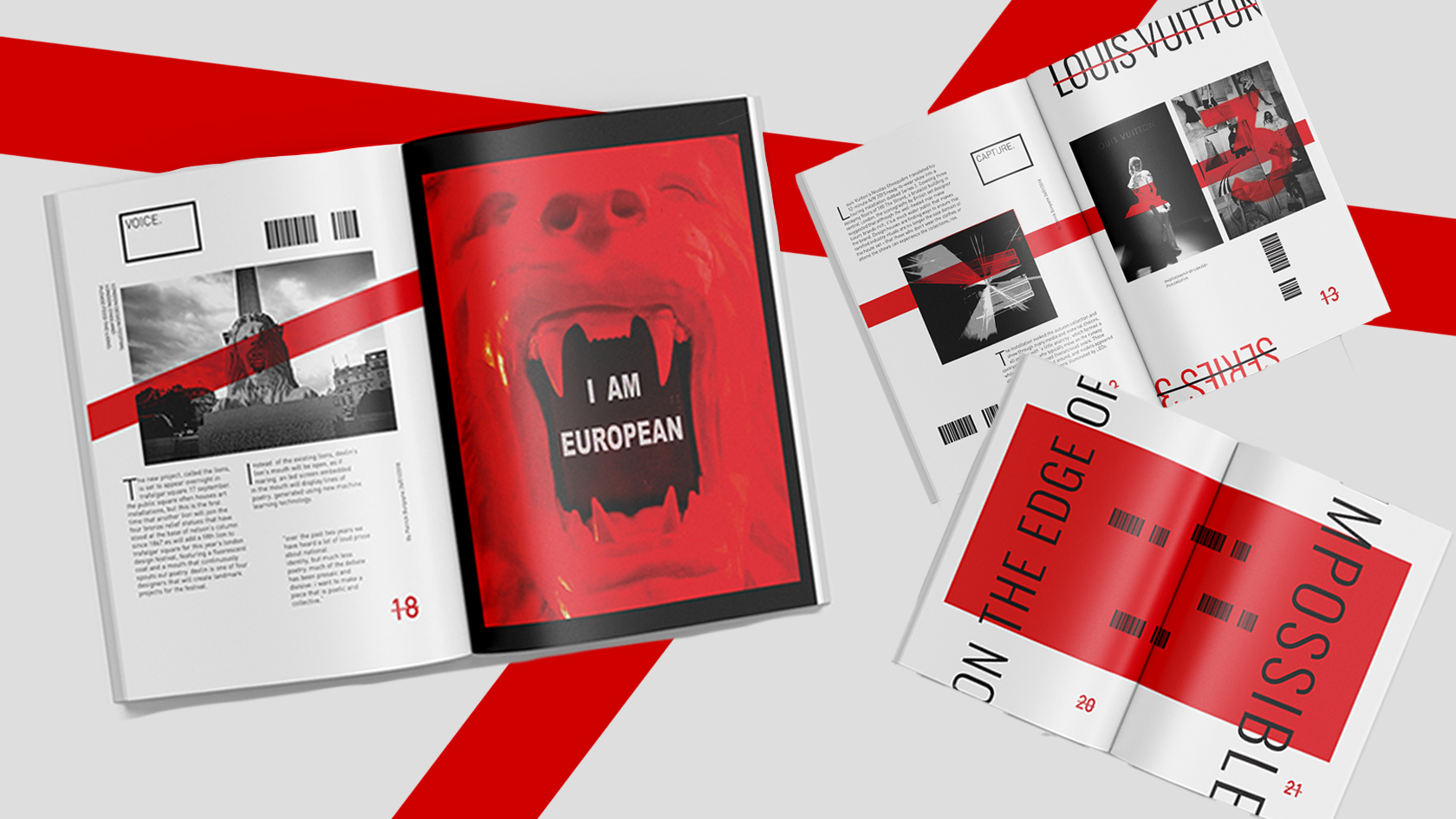
Magazine Layout
I designed a 24-page spread on stage designer Es Devlin. I chose the subject matter as inspiration for design and to create something I felt extremely passionate about. I use photos of her work to walk the reader through her process without needing to read the context on the pages. I used typography treatments and elements to center in on theories behind her work and keep the reader engaged and intrigued throughout the entire spread. I chose a one color palette to keep things cohesive and simple throughout the magazine.
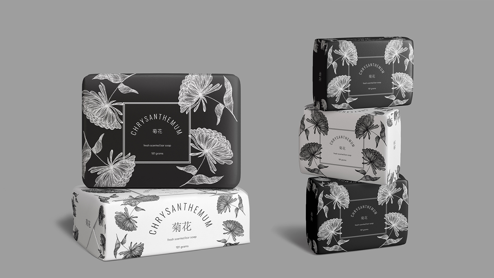
Soap Packaging Line
I designed a series of packaging for a cosmetic soap and lotion line. I chose to incorporate my hand made floral illustrations as the scent for the said product. I wanted to keep the packaging simple, fresh, and eye catching.
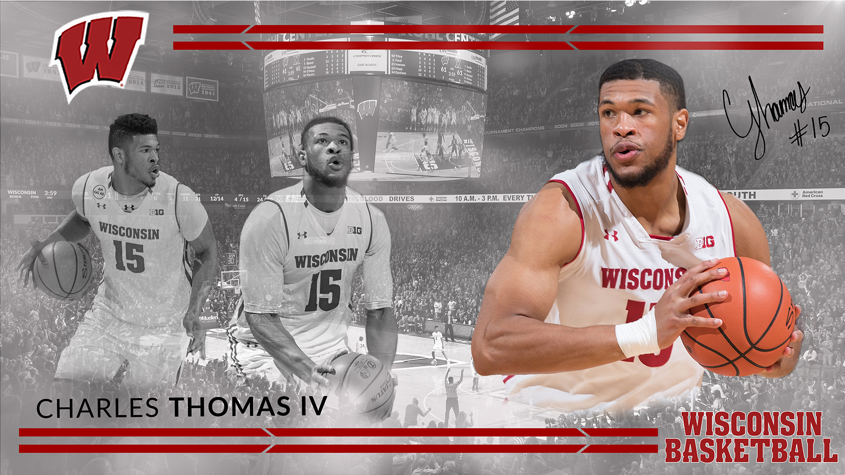
University of Wisconsin Men's Basketball
I was able to design the University of Wisconsin Men’s Basketball roster for large screen view in the Kohl Center. I chose to incorporate pre-existing branding elements of the University within the design such as the logo and markings to make it cohesive with the surroundings in the environment where the design would be displayed. I chose images of the players that exemplified passion, thoughtful energy and excitement. I wanted to incorporate the background image of the the court in grayscale to contrast the red as well as to emulate what the home court in the Kohl Center means to the athletic department, the University and the city of Madison.
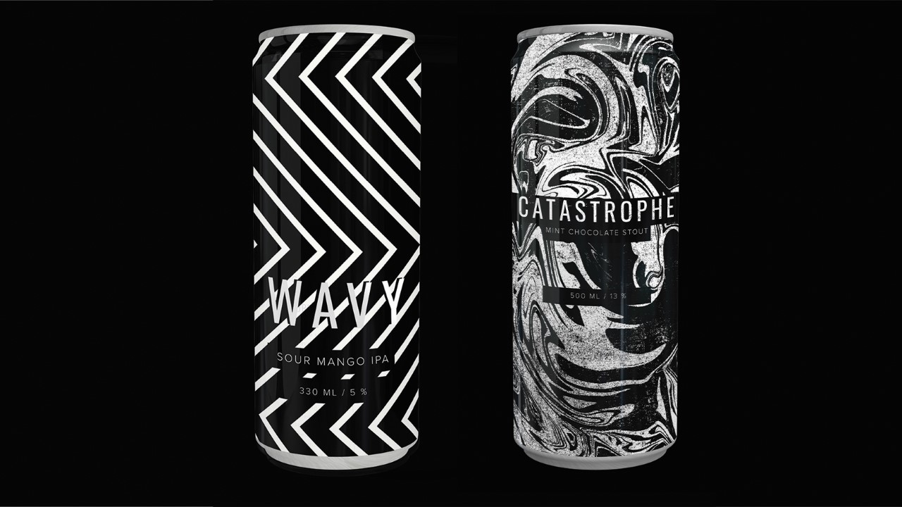
Beverage Packaging
I designed a series of beer can product concepts with a cohesive black and white optical illusion inspiration. I wanted to create a beverage line that used simple design concepts to represent different styles of the beer yet staying cohesive and simple throughout each separate product.
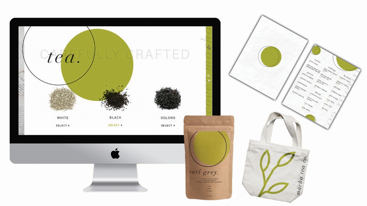
Macha Tea Rebrand
I designed a series of branding elements for a local tea bar in Madison, WI called Macha Tea. I chose to work off the logo for elements to use throughout the separate pieces as well as make them strong individually. I thoughtfully chose colors, type, layouts to create a cohesive look throughout the brand and make the separate elements look uniform.

WE ARE ALCHEMISTS.
We take raw elements like light & shadow, 0’s & 1’s,
time & sound, line & color, and make them communicate.
We create, we transform.
We make people feel, learn, think, sit up, and pay attention.
We are brilliant, talented, and skilled.
We are alchemists.
WE ARE GOLDEN.