Graphic Design & Illustration
Dani Grimm
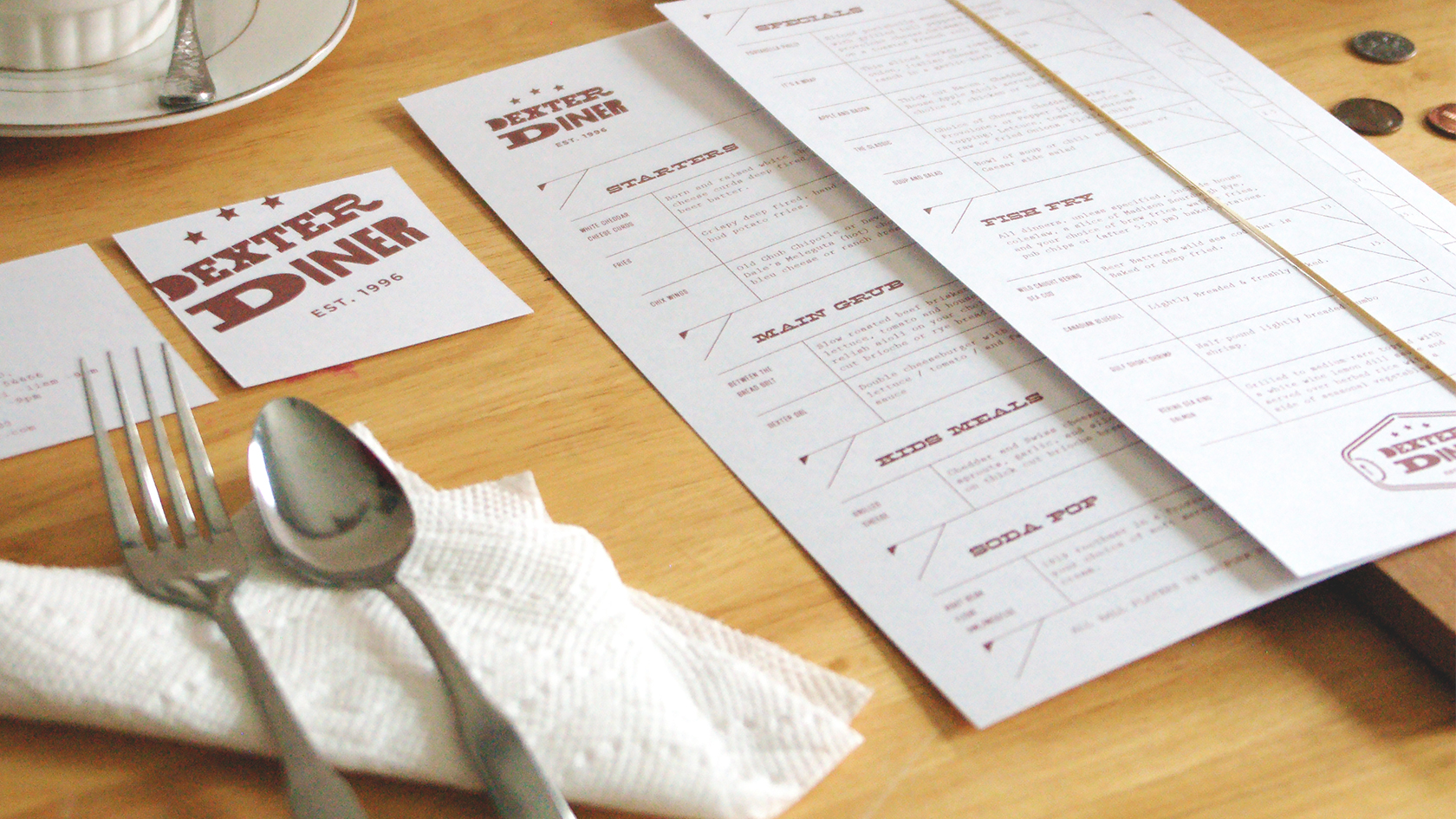
The Dexter Diner Branding & Menu design
Where the ball players get free cones in uniform and there is a cash only sign hung up locates my hometown diner that serves up a plate of food and even better root beer float. The Dexter diner is a tiny hole-in-the-wall that deserves a brand voice to be remembered. Pulling inspiration from old western taverns and retro gas pumps. I developed an identity and designed their menus to align their environmental and collateral design.
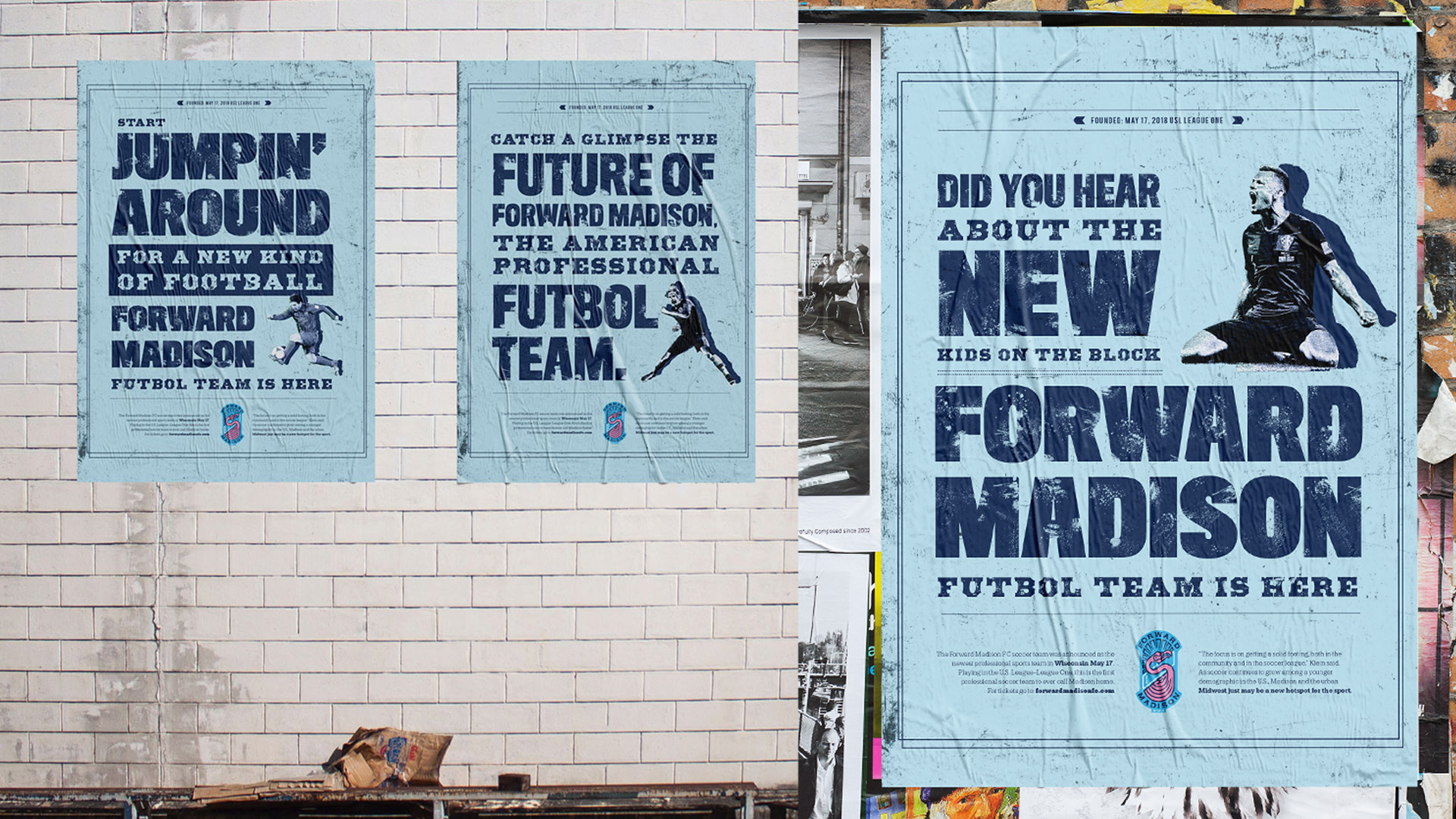
Forward Madison USL Soccer Team Public Service Campaign
This public service campaign highlights the release of Forward Madison, the new American Professional Futbol Team. With the use of strong type and emotional photography, this poster series reveals the intensity of the team and new identity.
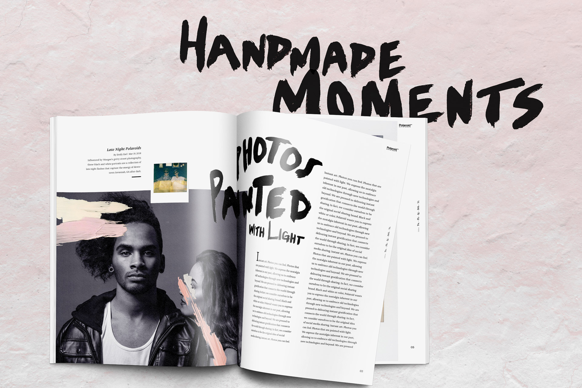
Polaroid Magazine
Polaroid has made it’s way back into pop-culture and I wanted to capture (no pun intended) it’s sentimental invention to how far it’s come today. This brochure uses the combination of some hand lettering and personal painting marks to bring a more authentic voice to the Polaroid brand.
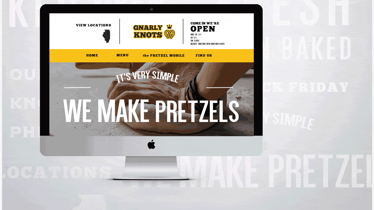
Gnarly Knots Pretzel Co.
Gnarly Knots is a Traditional Bavarian Style Pretzel Company based out of Winfield, IL. Given that this pretzel Co elevates the variety of pretzels, it seemed they could use a more distinctive brand voice—one that would draw the attention of pretzel lovers. The resulting identity and website combines friendly icons and an offbeat color palette with a side of humor, making for a brand as unique as the business itself.

WE ARE ALCHEMISTS.
We take raw elements like light & shadow, 0’s & 1’s,
time & sound, line & color, and make them communicate.
We create, we transform.
We make people feel, learn, think, sit up, and pay attention.
We are brilliant, talented, and skilled.
We are alchemists.
WE ARE GOLDEN.