

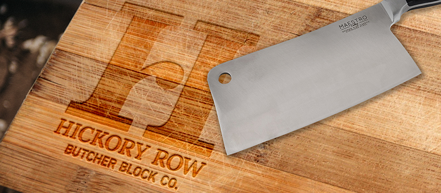
Hickory Row
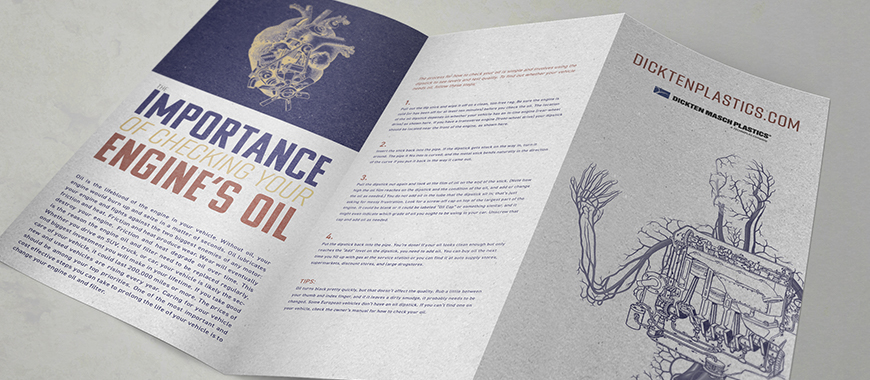
Dickten-Masch Plastics

Sunshine Showers Soap
Jazz Fest 1959
High Country Electric
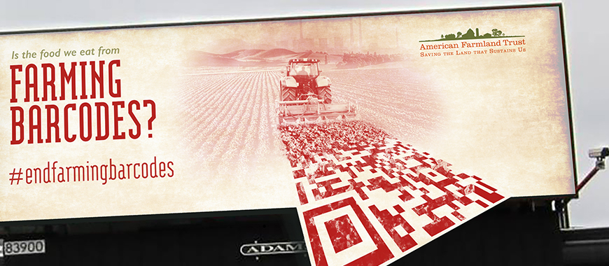
American Farmland Trust
 ©2018 Madison College