Aaron Smith
Graphic Design & Illustration

Mike n Ike's Ad Series
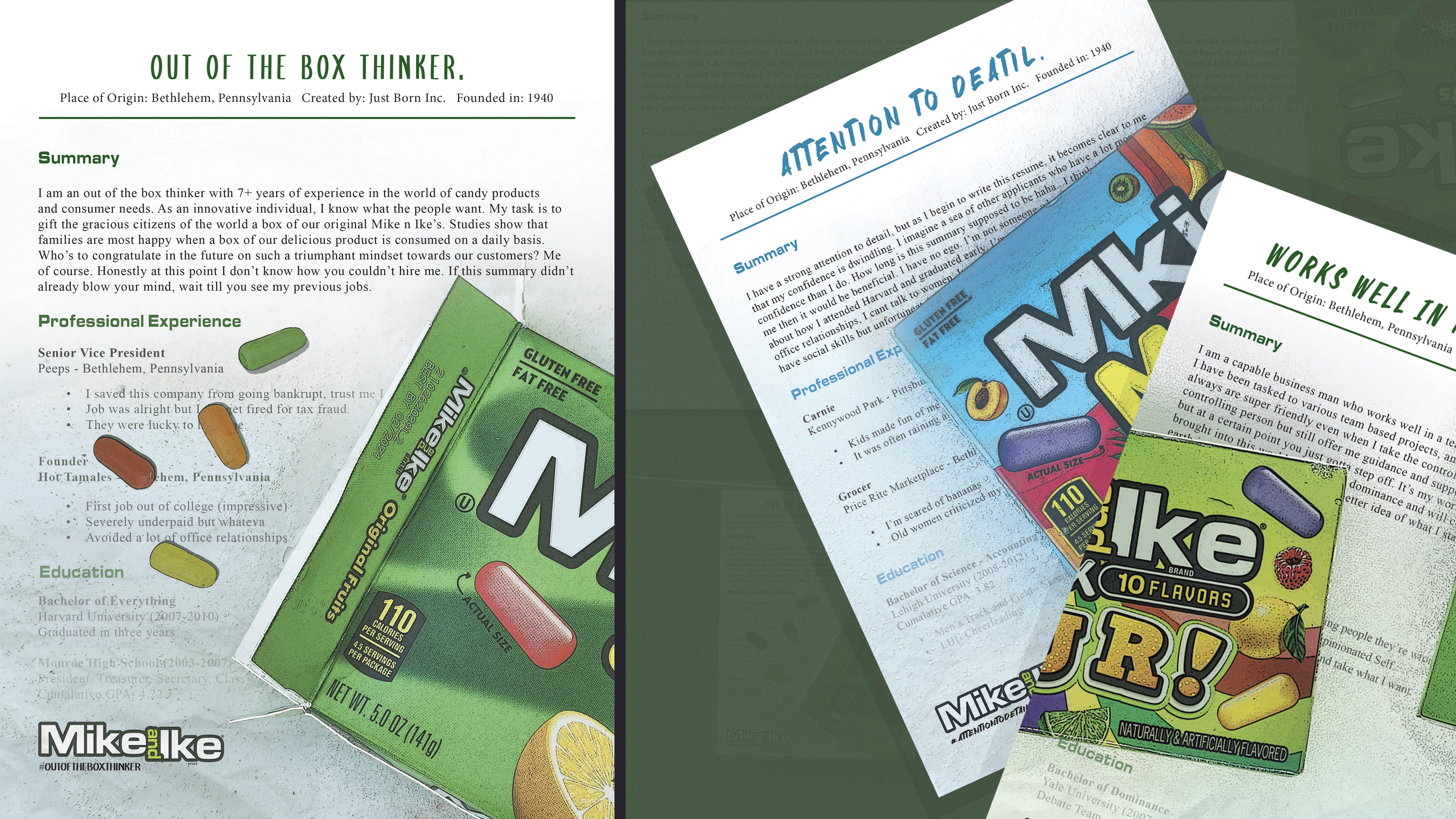
The goal of this ad series is to combine two very different concepts into one, that being résumés and the titular candy. The candy boxes present in each design relate to the given header above, and each poster has different personalities in terms of the copy underneath. It’s meant to demonstrate how these three variants so desperately want a job at an exclusive Mike n Ike’s corporation.
- Skills: Photo Compositing, Photography, Copywriting, Layout, Social Media
- Programs: Photoshop

Vintage Board Game Day Poster
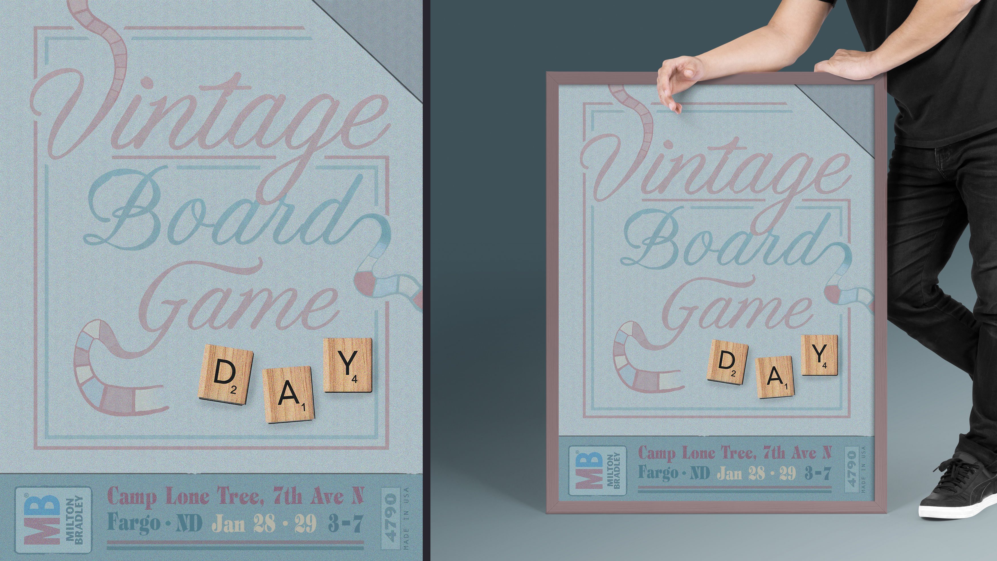
This composition is supposed to resemble an old board game cover, incorporating a combination of old-fashioned text with deviated road maps to fully bring it to life. I view this piece as a showcase for typographic hierarchy, one that hopes to spread the word about the annual event held in Fargo, North Dakota.
- Skills: Layout, Illustration, Typography
- Programs: Photoshop

Lobby Hero Broadway Poster
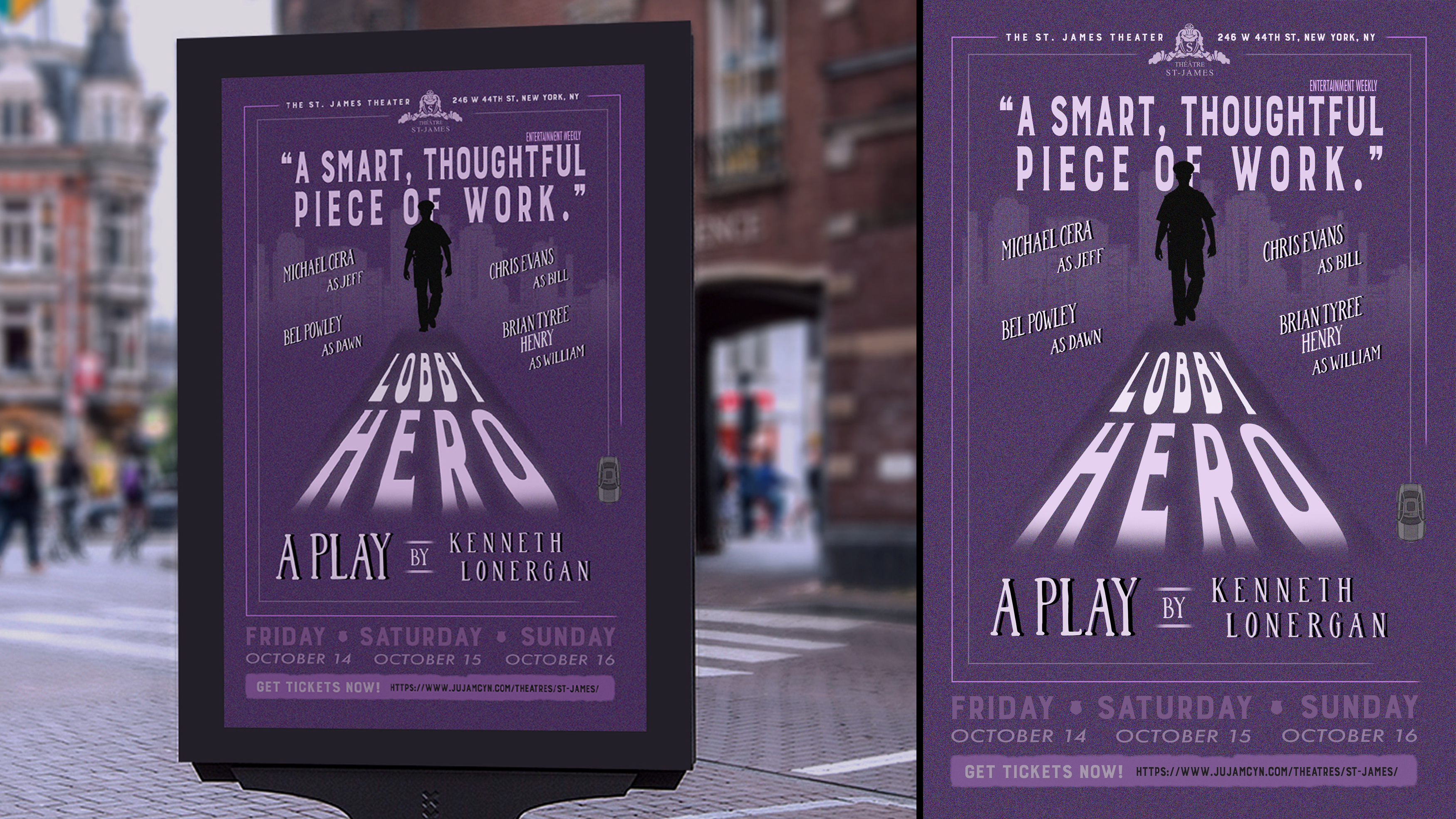
The goal of this piece was to create a poster that resembled works similar to historical Broadway designs. Through the use of silhouettes and prominent typography scaled large and small, this Lobby Hero composition celebrates historical theatre visuals by bringing them into contemporary design.
- Skills: Layout, Copywriting, Typography
- Programs: Photoshop

Sweet Jesus Magazine Spread
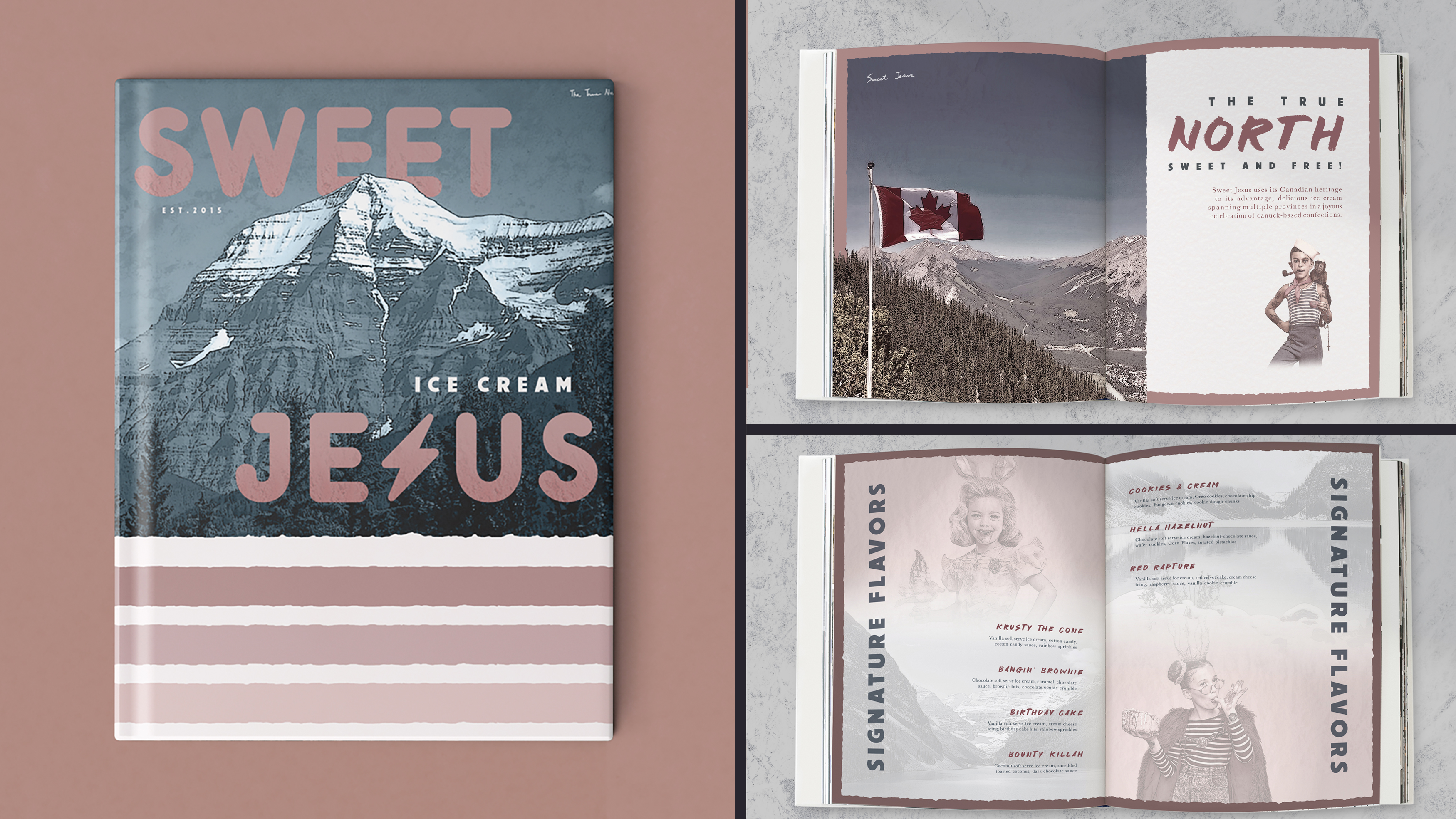
This spread is a combination of photo-collaged images and expressive type to highlight one of Canada's most celebrated desserts, Sweet Jesus Ice Cream. Rather than emphasizing the various sweets that define the business, the stylistic approach instead focuses on the country's breathtaking scenery, with subtle ice cream textures sprinkled throughout.
- Skills: Layout, Copywriting, Typography, Photo Compositing
- Programs: InDesign, Photoshop

Creative Director
Video & Motion
Design & Illustration
Archived Portfolios
Contact Us
- Contact - Program Faculty