Sara Woolery
Web & Digital Media Design

GongFu Tea e-Commerce Web Design
GongFu Tea is an independent tea shop in Des Moines, IA, with wonderful vibes and a very outdated website. The challenge was to bring the shop’s inspirational atmosphere to its virtual customers by modernizing their e-commerce experience. My initial concepts focused on GongFu’s curation of high-quality products from around the world, with a calming color palette that would match the store’s physical interior. I developed most of the visual design in Photoshop and then brought those elements into XD for layout and light prototyping. I reused one idea from the original website: I loved their product pictures of loose-leaf tea in little circles, so I photographed my own tea flat-lays. From the home page to the checkout page, GongFu Tea’s new site showcases a signature blend of familiar comforts and new adventures.
- Skills: Product photography, web design for e-commerce, brand storytelling, prototyping
- Programs: Adobe XD, Photoshop
Juniper Original App Design
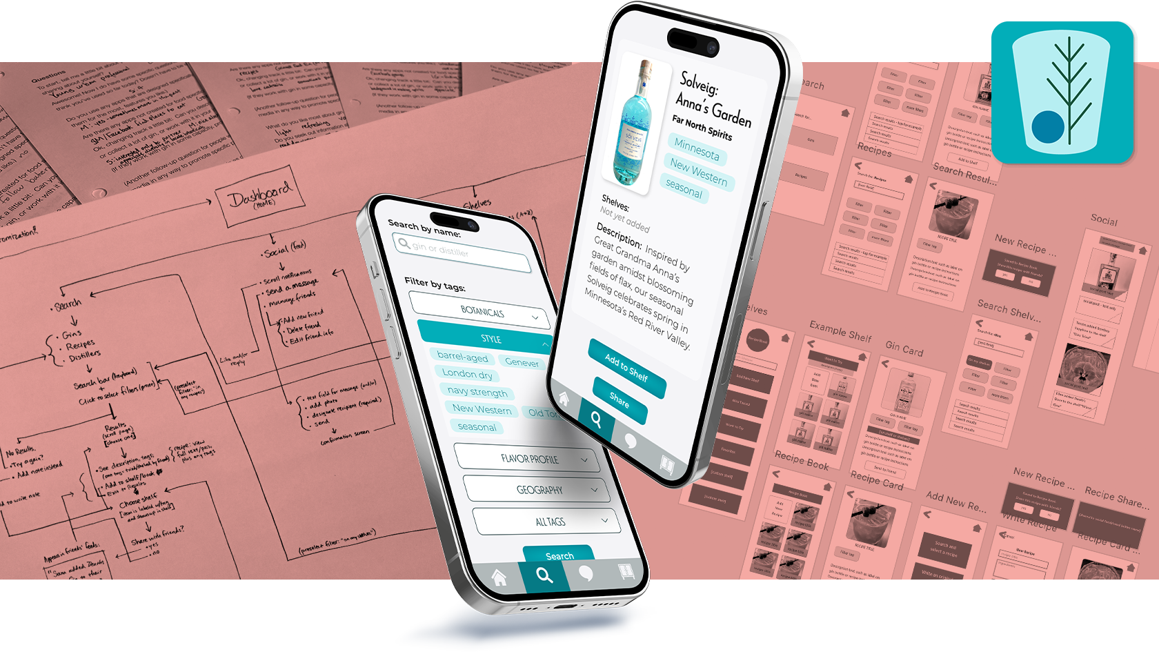
Juniper is a mobile app for craft gin aficionados—producers and consumers alike—that allows users to catalog gins and recipes and share them socially. I created a survey to find potential users, interviewed six people, and synthesized their responses to focus on features that would most likely be used, developing personas and empathy maps in the process. I mapped out user flows and prototyped the gin search function, a feature interviewees anticipated using frequently. This project spread over many months, and the UI design changed significantly in that time, starting with a woodsy-craft-inspired theme and landing in its current iteration of modern typefaces and trendy teal. I also improved the original navigation over the course of multiple user flow maps and prototyping exercises.
- Skills: UX research, interviewing, UX design, UI design, prototyping, app design
- Programs: Adobe XD, Illustrator, PoP (Marvel prototyping app)
Roll20 User Interface Redesign
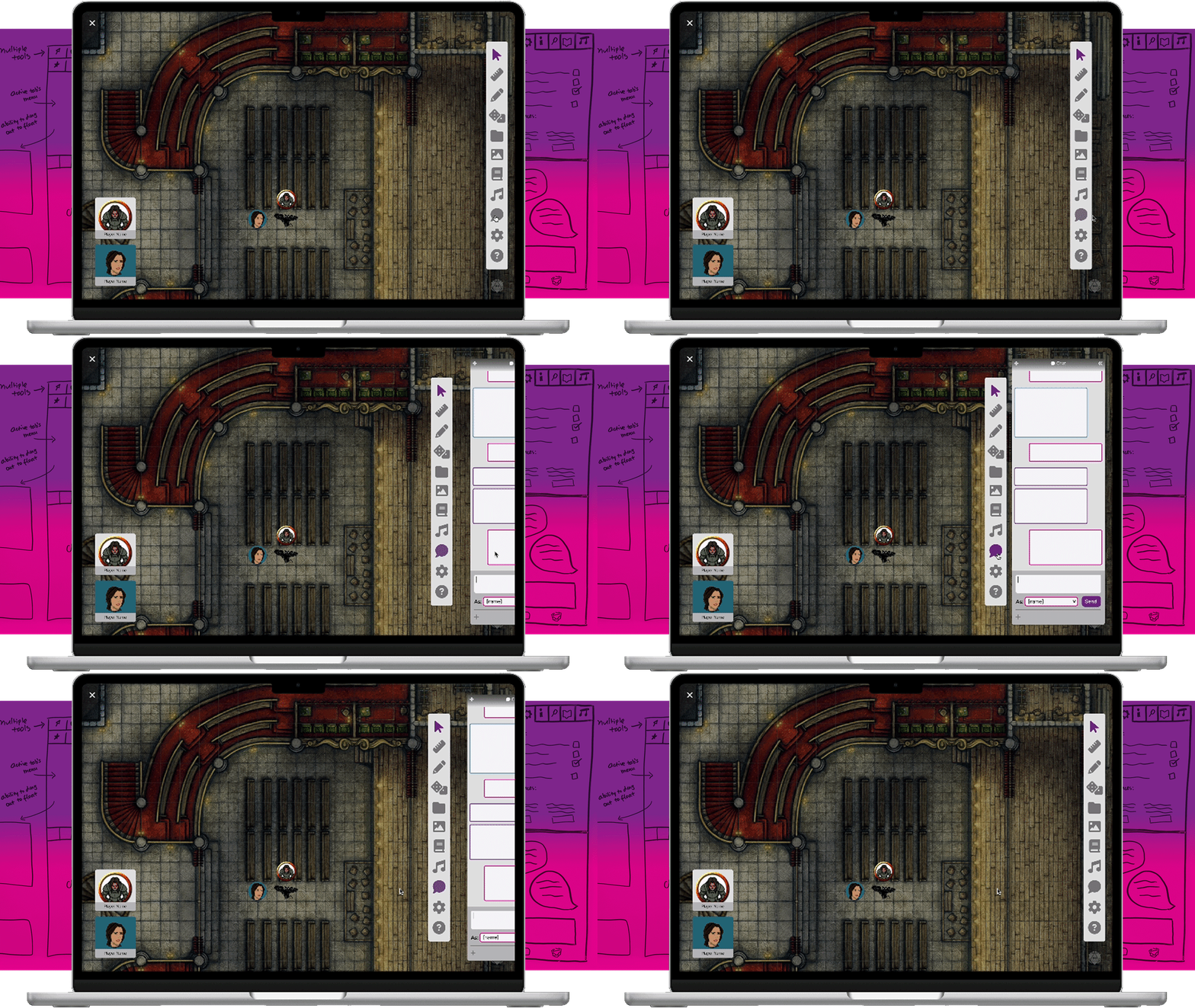
Tabletop roleplaying games, or TTRPGs, historically involve a group of people meeting up to play a game together (around a table). Roll20 is an online platform designed to replicate an in-person gaming setup virtually: a digital table, with dice, card decks, maps, player tokens, etc. The site has evolved over time to include more tools and offer more customization, but it’s difficult to use the interface without the help of many tutorials. My goal was to streamline the main page’s navigation and improve the information hierarchy so that new users could find tools and settings more easily, yet avoid cluttering up the gaming space. I achieved this goal through a process of user interviews, card sorts, lots of visual thinking on whiteboards, and multiple iterations of wireframes. The end result is a clean interface with recognizable icons, reorganized groupings of similar tools/options, and logically-nested menus that can be moved or collapsed to clear space as needed.
- Skills: UX research, UX design, information architecture, UI design, prototyping
- Programs: Figma, Illustrator
Storygraph Data Display Redesign
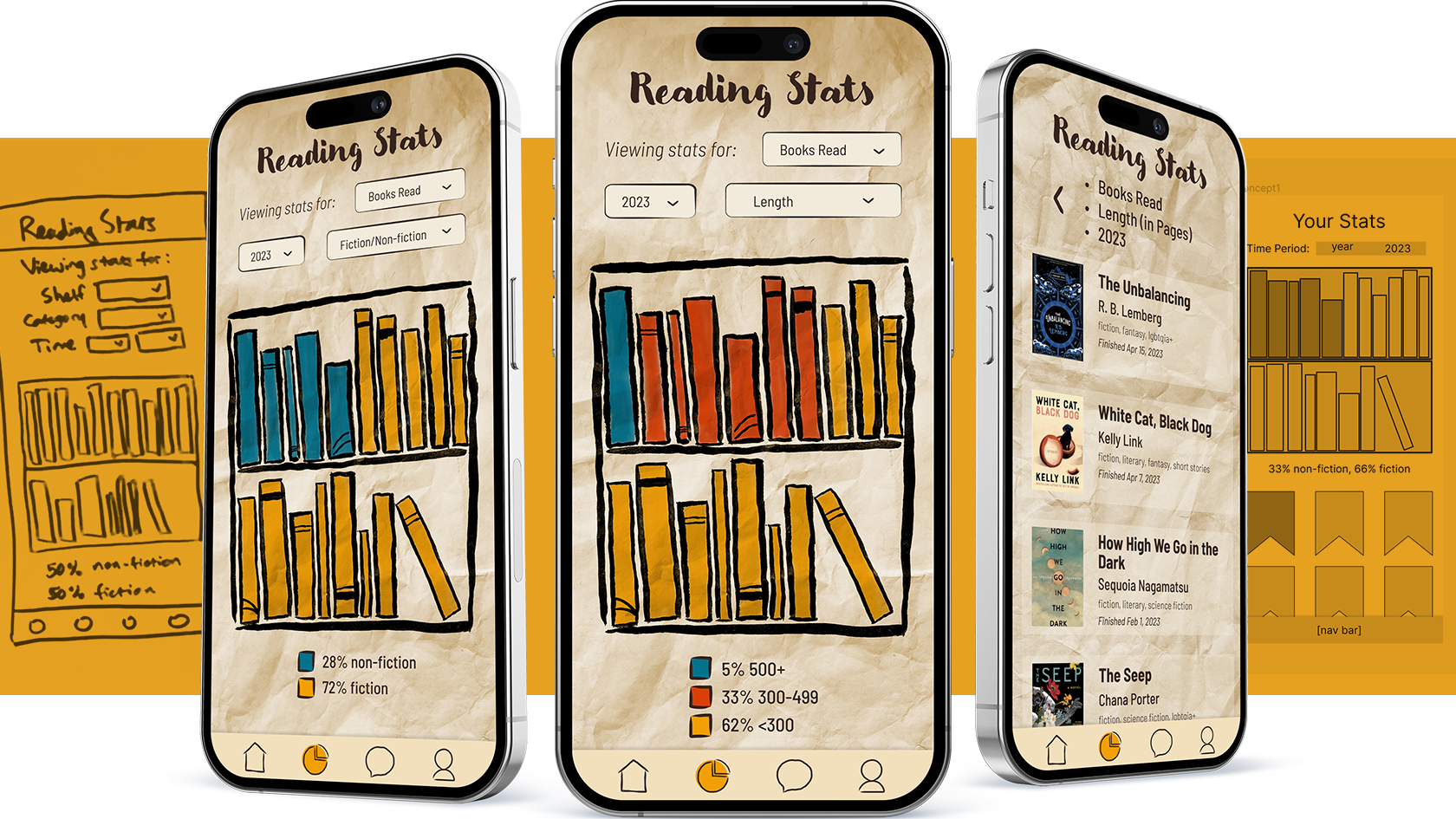
Storygraph is a social cataloging web platform and mobile app for readers to track, share, and discover books. It offers users a full page of reading statistics based on user input, making it a great candidate for an exploration of data design. Storygraph’s present UI works fine, but I wanted to a) condense the display for the mobile version, and b) add a more artistic touch. Starting with the idea of physical books made digital, I hand-painted a reusable bookshelf graphic on textured paper, used Photoshop to create multiple versions for different screens, and mocked up a simple prototype in Figma. The new display shifts between data categories within a limited screen space and does so with a papery-textured charm.
- Skills: Illustration, photography, data display, UI design, app design, prototyping
- Programs: Photoshop, Illustrator, Figma
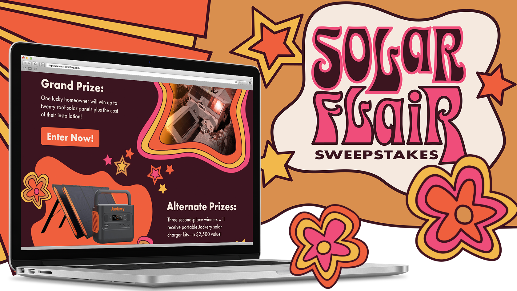
Solar Flair Sweepstakes Campaign
Solar Flair is a hypothetical co-sponsored sweepstakes contest promoting the switch to solar power. My goal was to create a distinctive visual style with versatile elements that could be reused across multiple platforms. Furthermore, in writing the concept and logistics of the contest, I wanted participants to see solar options as tangible and achievable. Accordingly, I chose large- and small-scale prizes, and prompted participants to consider the feasibility of solar as part of the entry form. For the visual design, the title pun led to drawing lots of little illustrations inspired by the psychedelic trends of the ‘70s. These illustrative elements were easily reworked to fit into a landing page, an Instagram story, and a series of MailChimp emails.
- Skills: Illustration, branding, social media, copywriting, motion design, web design
- Programs: Illustrator, Figma, Photoshop, AfterEffects, MailChimp
Creative Team
- Martina Seignarack - Art Director
- Cristian Velazquez-Avila - Digital Lead
- Jenna Sandstrom - Print Lead
- Abbey Smith - Lead Graphic Designer
Motion
- Cristian Velazquez-Avila - Digital Lead
Archived Portfolios
Contact Us
- Contact - Program Faculty